Image via Getty
NFL teams hate change, except when it comes to uniforms. We have seen seven new NFL uniform debuts this offseason alone. Teams change them all the time, and whenever they do, there's a good chance they're going to mess them up. This isn't a low-stakes thing, either. NFL rules state that teams have to wait five years after debuting new uniforms. That means if a team rolls out a dud, they're stuck with it. Still, teams go out of their way to be different and break away from their traditional looks. Most of the time this completely backfires on them, but they keep doing it.
With a number of NFL teams debuting new uniforms over the past few months, we figured it was the perfect time to roll out our official ranking of every NFL team's uniforms from worst to best. Not an easy task, but a fun one to dive into. As for the ranking, we did this by mainly looking at a team's primary uniform set. Most NFL teams have throwback jerseys, and while those help with style points, this ranking was done with their primary look in mind. With all of that said, enjoy.
New York Jets
The Jets have the worst uniforms in the NFL, and it ain’t even close. Their new look, which debuted last season and should be compared to something you’d see up in the CFL or Saturdays in Conference USA, is unassailably awful. Seriously, the Jets are dressed like a bunch of amateurs every week except when they wear their all-black uniforms. That’s when they look like complete clowns since black isn’t in their color scheme. Never has been. Never should be. Nike can’t redesign this disaster fast enough.
Jacksonville Jaguars
The Jags made the right call eliminating those atrocious gradient helmets, but these are still pretty terrible jerseys. Not to be too nostalgic, but they just need to go back to the look from the Mark Brunnell and Fred Taylor era. The color scheme isn’t the problem with Jacksonville. It’s just pretty much everything else that makes these bad.
Tennessee Titans
It feels like the Titans just have too much going on with their uniforms. The logo is still pretty great, but all the different color schemes have thrown us for a loop here. Back in the Steve McNair and Eddie George days, the Titans kept things way simpler with the uniforms, and it worked. As you can see above, there's just so much going on with the different color combinations. The theme throughout this entire list is the simpler, the better, folks.
Denver Broncos
Meh. Boise State sports a better look than the Broncos. John Elway can’t pick out a quarterback, but when he was Denver’s QB he looked downright swashbuckling rocking that 80s and early 90s logo/colorways. Broncos fans have made and posted infinitely better throwbacks than anything their squad will don next season.
Houston Texans
The Texans have a pretty awesome logo. That’s really it. The striping doesn’t look particularly good, navy blue is pretty meh as a primary color, and even though it's Deshaun Watson under center, I can’t help but think of David Carr getting sacked a record 76 times in 2002 when I look at these. We know Houston's first NFL franchise became the Titans, but Houston’s current team needs to figure out how to go back to that powder blue and red Oilers look as an homage to their predecessor. It looks much better.
Cincinnati Bengals
The Bengals have a great helmet. The jerseys and pants…not so much. The side panels Cincinnati sports on its jerseys are rightly ridiculed. Same thing with the pants. We know your mascot has distinctive features. That’s why your helmet stands out like few others in football—college or pro. But that doesn’t mean you have to slap stripes on EVERYTHING.
Seattle Seahawks
If you fuck with the University of Oregon’s crazy unis, then you’ll love what the Seahawks rock weekly. If, however, you prefer to not have your retinas seared by the obnoxiously bright secondary colors blasting through your HD TV, then, like us, you’re probably not a fan of Seattle’s uniforms. Objectively speaking, the Seahawks clearly have one of the NFL’s most distinct looks. Also, objectively speaking, if the Seahawks were lunching with Larry David at Tiato in Santa Monica they’d be seated in the ugly section.
Arizona Cardinals
These are fine. The logo is really good, and the all-black version is probably their best look. However, there's just something about them that is a bit off. Like we said, they're fine. The white unis with the red on the shoulders just isn't a great look, though. Also, the font in the lettering and numbers is just sort of meh. Very much a run-of-the-mill NFL uniform in 2020.
Detroit Lions
In 2017, the Detroit Lions went with the popular trend of slightly altering their uniforms and updating the logo. Like most NFL teams that try this, it didn't really have the intended outcome. The logo change was odd because the old one was fine, and the new uniforms sort of just look like the XFL version of the old Lions unis. Overall, they're fine and have a good color scheme, but the recent update didn't do much to make this one of the better uniform combos in the league.
New York Giants
If these rankings were based just on a team's color rush jerseys, the Giants would easily be in the top 5. Sadly, we're looking at the whole body of work and the primary uniform, which is just ok for the New York Football Giants. The old school 90s look really still is their best combination, and they should probably consider going back to that full-time at some point. As for now, the uniforms are fine, but pretty bland in comparison to other teams.
Washington Football Team
The Washington Football Team jerseys are very similar to their old jerseys that featured a logo and name that are no longer in use. They come in ant No. 20 here, but we'd recommend that they stick with this color scheme.
Minnesota Vikings
The Vikings are another case where they tried to fix something that wasn't broken. Their 90s look was classic, especially with Randy Moss and Cris Carter catching passes back in the day. In 2006 they changed everything up and it really wasn't great. They've been trying to get back to the classic look ever since and have done a nice job getting back on track, but nothing will touch those OG uniforms from the Moss days.
Indianapolis Colts
The Colts’ jerseys are about as simplistic as you can get. That isn’t necessarily a knock, but they kind of just exist. Thankfully, this isn’t a ranking of logos though because the new secondary logo the team unveiled for 2020 is less than stellar, to put it lightly. We won’t get too critical with Indy, though. Andrew Luck’s impromptu retirement probably still stings a little.
Buffalo Bills
Buffalo’s uniforms are…fine? Ok? Good enough? Not horrible? Solid? However you want to describe them, what the Bills wear week-to-week is neither exceptional nor a steaming pile of garbage. It’s acceptable, appropriate, and kind of what you’d expect a team from Western New York to wear. Nothing flashy here.
Chicago Bears
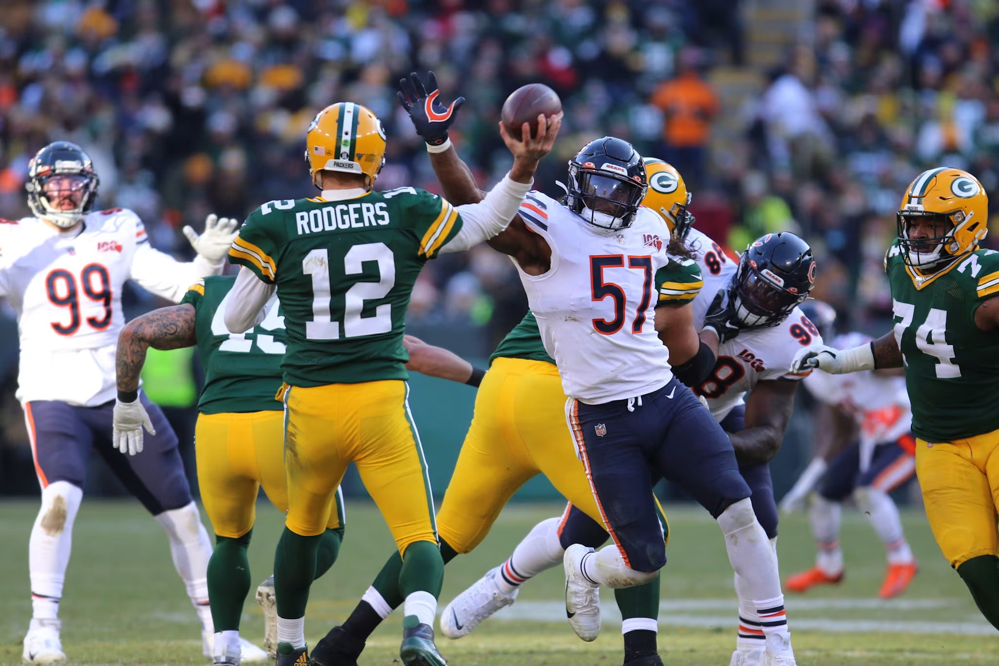
To be honest, the Bears get some credit simply for being one of the most iconic teams in the NFL. In another instance of a franchise refusing to waver from tradition, the Bears remain recognizable, but the familiar navy and orange look isn’t impressing us nearly as much as some of the other teams who have upgraded their look since inception.
Miami Dolphins
Real talk: the AFC East features more than its fair share of bad uniforms and while it’s debatable just how bad the Dolphins digs are these days, they definitely were way more poppin’ during Dan Marino's heyday. If Miami exclusively wore its throwbacks, like we saw them debut against the Ravens in the season opener last year, the Dolphins would easily have one of the NFL’s best uniforms. Everything else should be set on fire.
Kansas City Chiefs
The defending Super Bowl champs feature a classic look that dates back decades. There isn’t much bad to say about the Chiefs' threads. There also isn’t anything earth-shattering about maintaining the same look since the days of the AFL. These sit comfortably in the middle of the pack.
Carolina Panthers
Cam Newton not being under center for the Panthers will take some getting used to, but the team still possesses arguably the best running back in football. Christian McCaffrey will gain a shit ton of yards and score a shit ton of touchdowns in these jerseys. Even though the team will probably suck pretty bad, that mix of Panther blue, black, and silver is just nice to look at. Anyone who disagrees and is lucky enough to draft CMC in fantasy this season, I’m sure you’ll take a liking to them too once he has you comfortably atop your league by mid-season.
Baltimore Ravens
This upcoming season marks the 25th anniversary of the Ravens' NFL debut. Thankfully, their jerseys haven’t undergone much of an overhaul in that span. From the dominant defenses led by Ray Lewis and Ed Reed to the current team captained by the electric Lamar Jackson, the mix of purple, black, and gold is just a winner. Kudos to the franchise for realizing that and whipping up a ton of combos for fans to look forward to each week.
Philadelphia Eagles
Plenty of Eagles fans have begged for the return of the kelly green jerseys donned by legends like Randall Cunningham and Reggie White back in the ‘90s, but that doesn’t appear to be happening any time soon. That also doesn’t make the midnight green look bad, though. The black-on-black kits, in particular, are foolproof, and the white tops with green pants are nearly flawless. The franchise also captured its first Super Bowl with this look. Maybe Eagles fans should pump the brakes on the kelly green nostalgia for a little bit.
San Francisco 49ers
The Niners have underrated great uniforms and should never mess with them. Scarlet red jersey with white numbers, gold pants, and a gold helmet featuring the interlocking SF logo. As smart and simple a combination as it is classicly sublime.
Green Bay Packers
Definition of an NFL classic right here. The Packers have barely changed their uniforms over the years, and for a good reason. Don't mess up what's already working. The green and yellow paired together is an iconic look and that will never go away. We can't say the same about Aaron Rodgers playing in them forever, however. But that's a different story.
Dallas Cowboys
People might get mad that the Cowboys are No. 5 in our rankings, but that's just the way it is. Another iconic look with the star on the helmet and an amazing color scheme. When you think NFL uniforms, you think about the Dallas Cowboys. You can't really go wrong with any of the combinations. They'd be foolish to ever change these in any drastic way.
Pittsburgh Steelers
We're just in complete classic territory right now. The Steelers look has been iconic since the 1970s and hasn't changed one bit. Yes, they used to wear those awful bumblebee kits, but their main uniforms are so clean. Just a perfect color combination and look from head to toe.
New Orleans Saints
The New Orleans Saints might have come up short the past two seasons in the playoffs in heartbreaking fashion, but they always look good doing it. The color scheme is just too clean. Their white and gold color rush option is especially good. The Fleur De Lis on the helmets and gold detailing make the Bourbon Street inspiration evident without bright hits of green and purple. That would be overdoing it. The Saints haven’t seen a drastic change to their unis in years, but they don’t have to when they look this good.
Las Vegas Raiders
It still feels weird typing out Las Vegas Raiders but when it comes to uniforms, it's hard to do much better than this look. The bad boys of the league have always sported some of the best jerseys, and that's not changing any time soon. From the logo to the silver and black color combination, these are just perfect and forever will be.