
Jeff Staple still keeps a printout of his credit score from 2005. “669 Poor” is prominently displayed at the top of the page citing factors like high balances and late payments as reasons for the bad credit rating. It may seem like an odd memento to hang on to. For Staple, who is now in his 25th year as a business owner, it’s proof that anyone can build something like Staple regardless of where they start out.
“I want people to realize two things. One is you don’t have to come from privilege or wealth to do this. It helps for sure, but I think there’s a certain resilience when you start from nothing. I’m not saying I came from extreme poverty but definitely not in a position where I got any sort of outside investment,” Staple tells Complex. “After I self-started Staple, I put myself into crazy debt. At one point, I was like $150,000 in debt, maxing out eight different credit cards, because that’s how much I believed in Staple. I was just putting everything on the line to do it. And this credit score sort of proves that.”
Staple’s belief in his label paid off. Many people know him and his brand for its ongoing series of pigeon-themed sneaker collaborations that began in 2005 with the Nike SB Dunk Low and has gone on to include everything from Puma Suedes to Crocs clogs. But Staple’s resume goes beyond gray and orange “Pigeon” sneakers. From 2001 to 2016, he operated Reed Space, a streetwear boutique stationed at 151 Orchard Street in New York City. Before he entered the clothing business, Staple was creating in other mediums by producing album art for Rawkus Records artists like Common and handling art direction for early issues of Fader. His work at the magazine would prove to be a pivotal step in his career path. It’s how he was first introduced to Nike, the collaborator that helped him gain a ton of momentum in the early days of Staple. A quarter of a century later, his brand is still around. What does he credit his longevity to? Consistency.
“I haven’t been the most hyped. I haven’t been the most creative. I haven’t been the most well funded. I haven’t been the most connected, but I would argue to anyone that I’m top three most consistent,” says Staple. “If you’re a great swimmer, it’s the one who can hold their breath longest underwater. And that’s something that I always subscribed to. Funny enough, when I was a kid, I would have competitions with friends to see who could hold their breath underwater the longest. Oftentimes, I would win. I could go, like, two and a half minutes underwater. I used that mentality in my business. Longevity. Consistency. That’s what I was always about.”
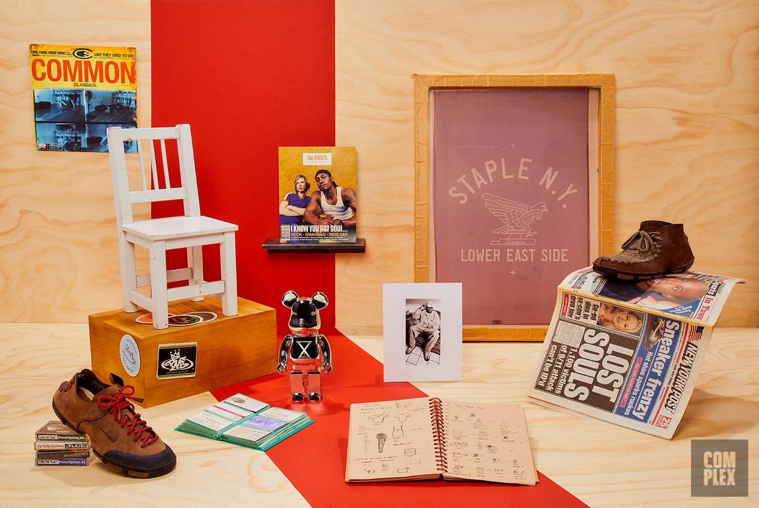
We recently caught up with Staple to run through some of his most sentimental items that help tell his 25-year story in streetwear. From his book of business cards to an original Staple ad featuring T-shirts modeled by Mos Def in the Rawkus Records office, check out each item along with some memories from the designer below.
Original Staple Silk Screen
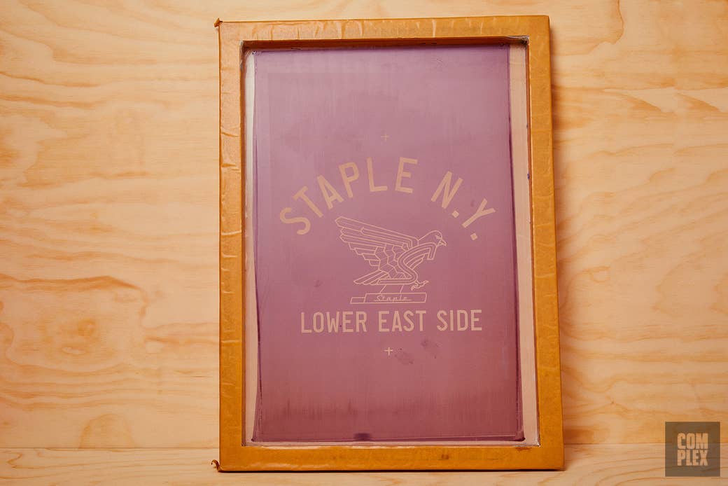
Those are silk screens that I actually made by hand. I want to articulate what it means to make a silk screen by hand. You actually have to stretch the silk across this wooden frame, put the emulsion on, shoot the art into it, wash it, dry it. Then you can be printing shirts after you have procured silk screen inks, a squeegee, and blank T-shirts. So all of that is how you can begin to even just make one tee. It was just the most addictive, dopest feeling to be able to hand-pull your own shirt and then just hold it up. You just made this creation, you know? So I was addicted from the start. I was attending Parsons School of Design, art school, and it was a silk screen class, but it was a silk screen class to teach people how to do silk screen on paper and not on fabric.
So the teacher was like, “You can’t print on shirts.” And I didn’t like that because I was paying a pretty hefty tuition for school. So me and a friend left the window of the silk screen lab unlocked and we broke into school at night with a pillowcase full of T-shirts to start our own little silk screen factory after hours in the school. So there’s already this kind of punk feeling around it. That was awesome. That was just so addictive. Imagine two kids breaking into school at night silk-screening shirts with the intention of having an art project. Instead of giving my friends in school a poster that they put up in their tiny Brooklyn apartment that no one ever visits, I could give them a T-shirt instead and they can rock it. And thousands of people every day on the subways and buses and trains can see my artwork. That was really, really awesome to me.
‘Fader’ Magazine Covers
I went to school for communication design, which is a glorified way of saying graphic design. So while I was doing this burgeoning streetwear brand, I was also really interested in doing graphic design for different clients around the city, whether that be, like, early album covers, CD covers, club flyers, invites, business card logos for people. I was just taking any sort of job I can get.
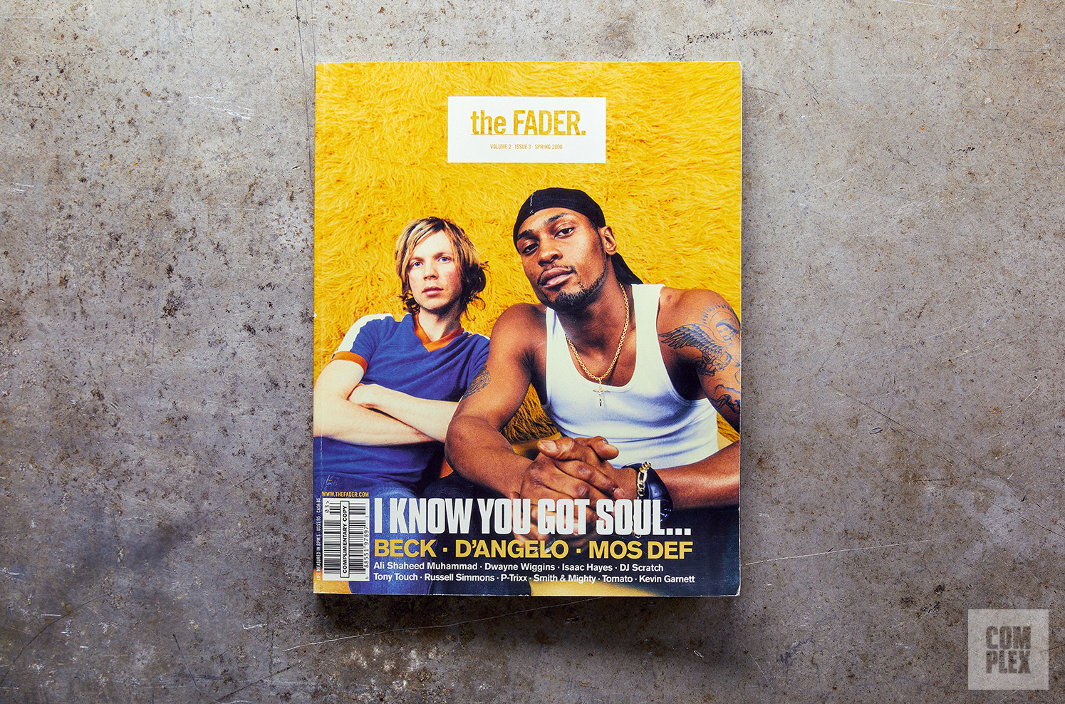
One of my earliest clients was actually Fader magazine, which at the time was literally starting off from nothing. They made one prototype issue, but they asked me to really refine everything and make the creative direction and art direction for the future issues going forward. And so being a part of Fader at the time was just amazing cause they were like one of the first publications that mixed music, hip-hop, sneakers, and fashion all into one print publication. It was really not being done before that. So being on the ground floor of that and setting the creative direction was epic. It’s also a really important step in my career because I was then able to even meet Nike. It was my introduction to Nike and that’s how I got my foot in the door there. Fader was integral to the future of me and the brand.
My most memorable cover is the one with Beck and D’Angelo on the cover. That one was pretty crazy. The back cover of that is Mos Def, so you have Mos Def on the back and then Beck and D’Angelo together on the front cover. Jonathan Mannion actually shot the cover for that. So I got to work closely with him. Mannion is a legendary hip-hop photographer. I think that was the second issue that I worked on. This is like early, early in my career. And just getting thrown into the essence of New York City culture was amazing.
Rawkus Records Album Covers
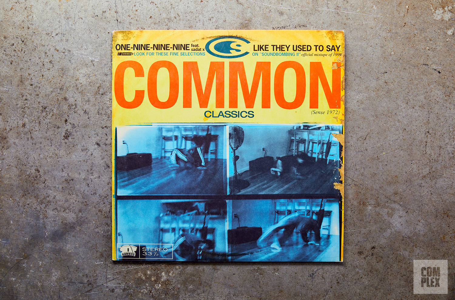
I designed a bunch of album covers for Rawkus. So Rawkus Records was another design client of mine. It was just cool to be able to weave all the different aspects of what I was doing into Staple. As I mentioned, Fader was my segue into Nike and then you’ll see later, Mos Def that appears in early Staple ads and stickers and stuff. To me, that era of hip-hop was the last real golden era of hip-hop culture with Black Star, Company Flow, Mos Def, Talib Kweli, and No I.D. started at Rawkus. The first time Eminem ever appeared on a record was on a B-side of a Rawkus 12-inch with DJ Spin on side A. That was really like epic times in hip-hop culture.
One of the most memorable covers I worked on was for Common. Common was like one of my favorite rappers of all time at the time and still is. I actually sat down knee and knee with Common to work on [One-Nine-Nine-Nine / Like They Used To Say]. The photographs of the kid on that album are of Mos Def’s kid, like break-dancing. And then on the back, I had this concept where I was like, “I wanna write one of your verses, Common, so that it looks like it’s coming straight out of your sketchbook.” He showed me a sketchbook and admitted that his handwriting was terrible. He was like, “Why don’t you write it? You have really great handwriting.” And so I wrote it. I wrote his lyrics on his own album cover. It’s like, “What? I’m bugging out here. You’re letting me use my handwriting for your words?” It was crazy.
‘New York Post’ “Pigeon” Front Page
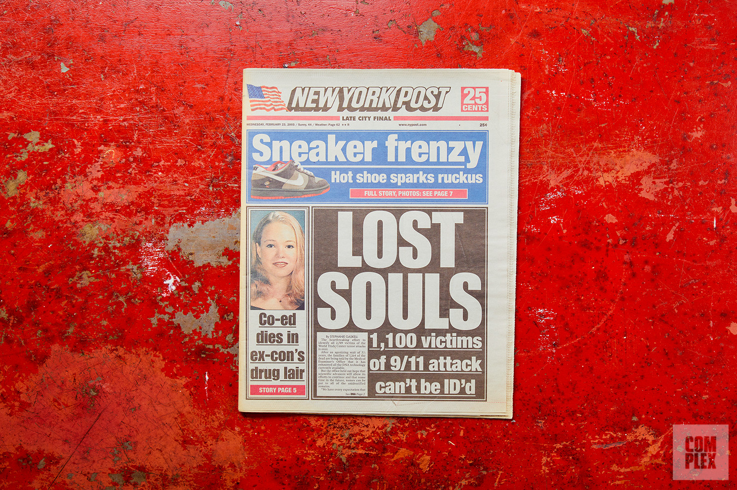
This day, Feb. 2, 2005, was just a historic day for me but also I think a game-changing day for sneaker culture in general. Prior to this, sneakers, sneakerheads, and sneaker collectors were like a subculture. It was a niche. It was like a couple hundred people in downtown New York City who were obsessed with shoes, waiting in line, camping out, reselling — not on any eBay, GOAT, StockX platform, but like reselling to your homie. You would wait in line, cop one, and then you’d make $10 upselling it to your friend. That was reselling. So it was really, like, a subculture at that time. And then it was after this New York Post headline that everyone realized what was going on in this subculture. If you’ve heard the expression “hopping on the bandwagon,” I think this was the creation of the bandwagon that everyone then hopped on. This was a pretty special moment.
I’ve done so many “Pigeon” projects. That was my goal. That was one of my intentions. When I grew up, I was really a big fan of graffiti artists. There’s a term called “going all city,” which means you can get your tag in every borough of the five boroughs or you do it on the side of a subway train so everyone in all of the five boroughs can see your tag as it goes through all the subway systems. I dabbled in graffiti, but I didn’t have the balls to actually go and hang off of the side of a train and do graf. I didn’t want to get arrested either. But this idea of creating a brand, or a mark like a tag, and then being able to put that “tag” on all these different surfaces like a watch or a camera, that to me was like the graffiti spirit of going all city. So that was a very intentional thing to create a mark and also create a colorway. Owning a colorway is damn near impossible. There’s like Tiffany blue, Coke red. There’s not that many brands that when you see that color combination, you see that brand. But that pigeon gray with the pigeon pink of the feet and the white pop, that started with the “Pigeon” Dunk. And then we applied it to so many different things.
That was full graffiti artist mentality, me just trying to bomb the system. I think in the past quarter of a century, I’ve done a pretty damn good job of bombing many, many systems. Even among the greatest footwear designers of all time and the greatest collaborators, I can’t really think of anyone who has been able to apply their mark to so many different surfaces, brands, and products. I sometimes hear people be like, “Yo, you’re so boring. You keep doing the same thing over again.” It’s like, “Yes, that’s my intention.” It’s like Futura’s tag or the Obey Andre the Giant sticker. The point is to put up as many different stickers as possible. The point is everywhere you go in the world, you see the same sticker, the same tag, the same pigeon, the same colorway.
Nike Considered
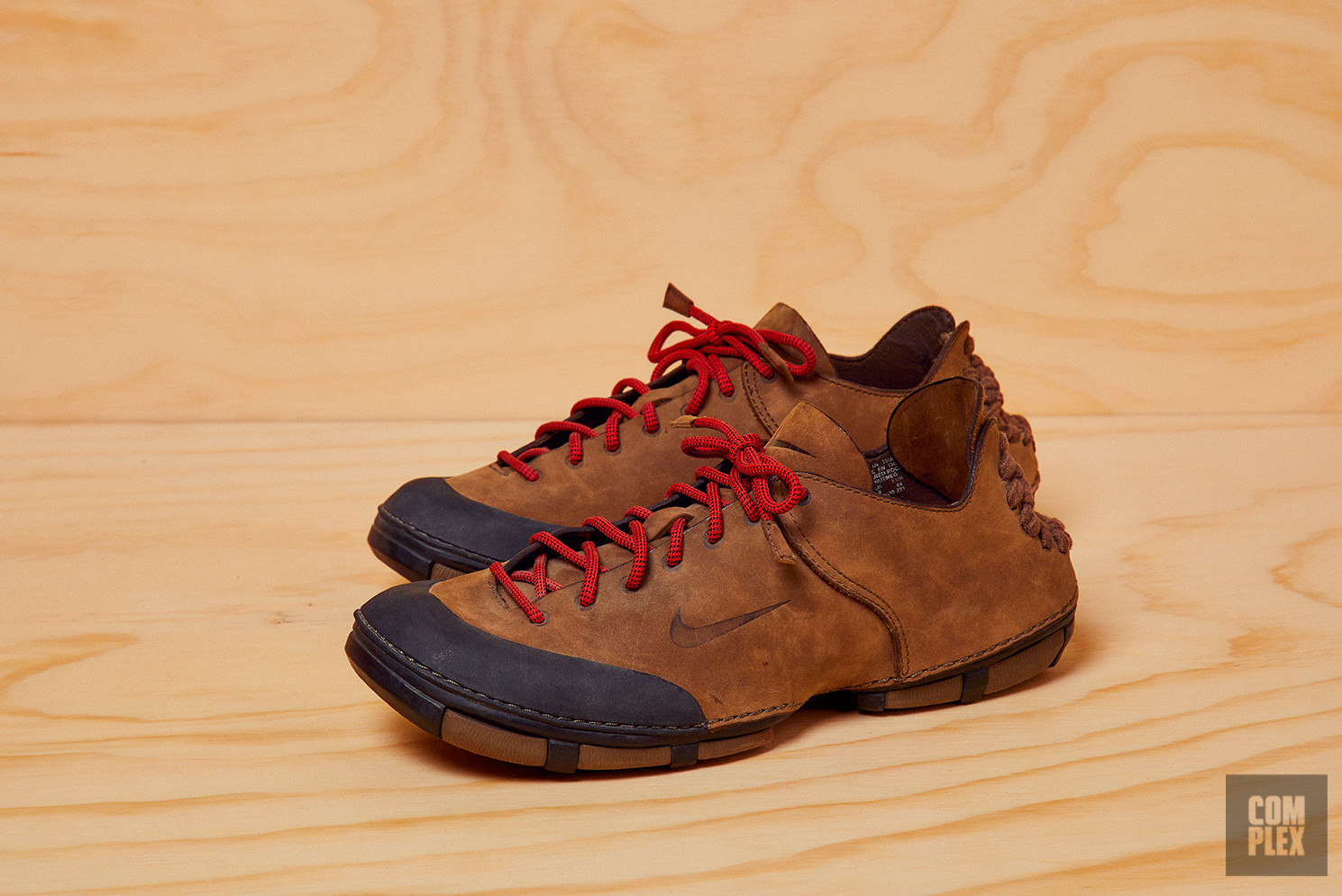
Considered is amazing. That’s my sort of side flex in response to all the people who say I do nothing but put pigeons on shoes. Nike Considered was Nike’s first foray into sustainable footwear: completely closed loop, 100 percent recyclable, veg tan leather, all the parts of the shoe being made within like 100 kilometers of where they’re assembled. It was a short-lived project that Nike did. They asked me to come in to work on the naming, the manifesto, the copywriting, the retail rollout. This whole entire line actually launched out of Reed Space. Being on that ground floor, it was like a pretty renegade team at Nike of like five people who were working on Considered.
If you follow this guy, his name’s @mcsteve on Instagram, he was one of the footwear industrial designers on the project and you can see he gets on his soapbox about Nike Considered and how big that could have gotten. We were really ahead of our time with that project. So being able to work on a project like that is just a great exercise in what I learned as a footwear designer, a graphic designer, and just fashion designer as well. To be able to apply it to a dope project that did something good for the Earth, like Nike Considered, also just shows that I can do more than just put a pigeon on the side of a shoe.
Reed Space Chair
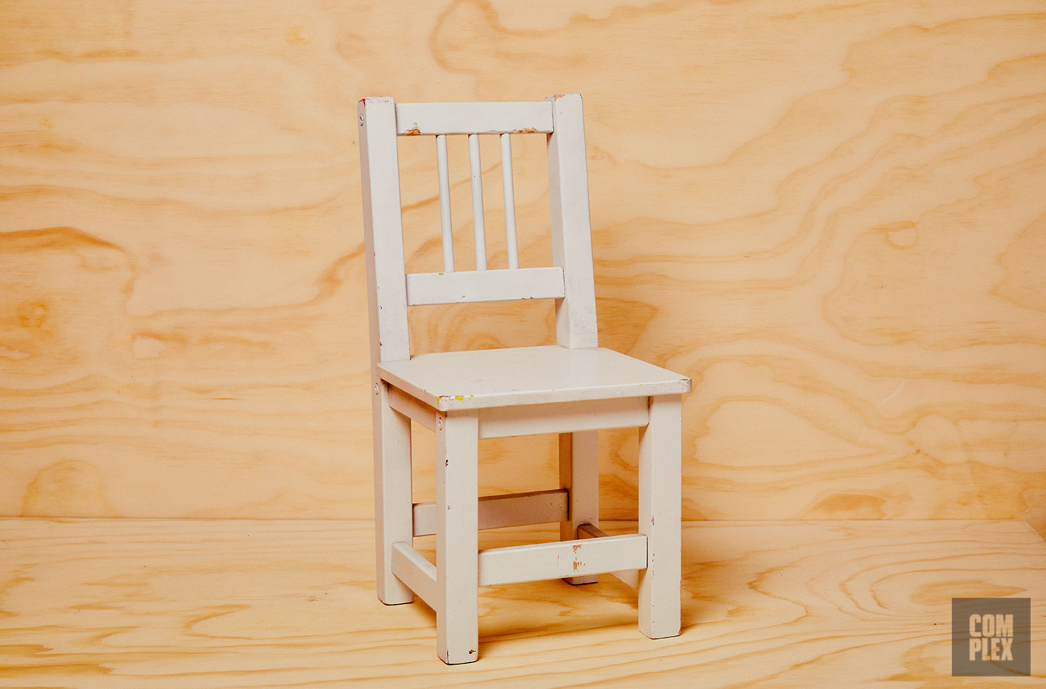
In Reed Space, one of the most iconic things that I did was put an entire wall of kid’s chairs that served as the shelving unit for displaying books, graphic novels, and zines — just supporting local independent publishing. That chair ended up becoming basically our logo. I just wanted to represent Reed Space. Reed Space stood at that same spot at 151 Orchard Street for 15 years, from 2001 to 2016. That chair represents a lot. After the store closed, we then adapted the name of Reed Space to the agency. So the creative agency that I run is called Reed Art Department, formerly known as Staple Design Studio, which was the agency throughout this whole entire time. We rebranded it to become Reed Art Department because as the agency grew people were getting confused about the difference between the clothing line and the design studio. The chair and the Reed name get to live on.
It’s a love-hate relationship [with brick and mortar retail]. I always loved retail and I think it’s still super important in the whole design experience and product experience. After Reed closed, I did, like, three years as creative director of Extra Butter. I revamped the entire Extra Butter brand, from the branding to the interior and everything. That was so much fun because I got to do all the fun stuff that I love about retail but none of the shit that I hate about retail, like ops and logistics and warehousing. I was great partners with the original founders of Extra Butter. So that was fun. After that, I went on to consult for Hypebeast because they were about to launch their retail banner, HBX, in New York, like a massive flagship location in Chinatown. I consulted on that and led creative operations for that right up until COVID and everything shut down. I was extremely, extremely glad that I did not have a retail store at that point. That was very, very difficult if you had a retail store. So I go back and forth, man. I would love to have a store, but god forbid some new variant comes out and the city shuts down again. You’re just sitting there dead in the water. I gotta figure out how I get my footprint into retail without the stress.
Book of Business Cards
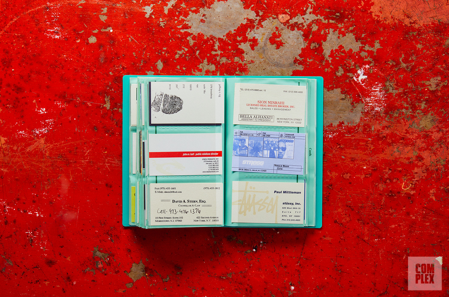
I’ve made a couple of business cards throughout my career and I really still care a lot about them. I think it’s like a lost art, sort of. I started posting other people’s cards and it’s just great to see. I have binders full of cards that are so organized and alphabetically listed out and everything. I just think it’s cool to see all these people and where they are now — all the career paths and the introductions that they had to go through.
That’s what’s cool. My path is very different because 25 years ago, I had a Staple business card and today I still have a Staple business card. So for the past 25 years, I’ve just been honing this one single thing for all my life and other people might have 10 different business cards. But you can see the lily pad effect of, like, where they’ve gone in their career. Everyone’s just got a different path in life. And I think the business card is kind of like a nice physical ticket stub of your life chapters, you know?
It’s almost like collecting trading cards. After I put out that post, a lot of people were like, “Yo, you should do a business card book where you just have everyone’s cards.” It would be sick. It’s a great graphic design novel just to show logos, type treatment, color, stuff like that. But then it’s also just a great historical view on the culture. I have from Angelo Baque, founder of Awake, his, like, intern photo, freelance business card. It’s dope to where these people have come and gone.
Staple Operations Sketchbook
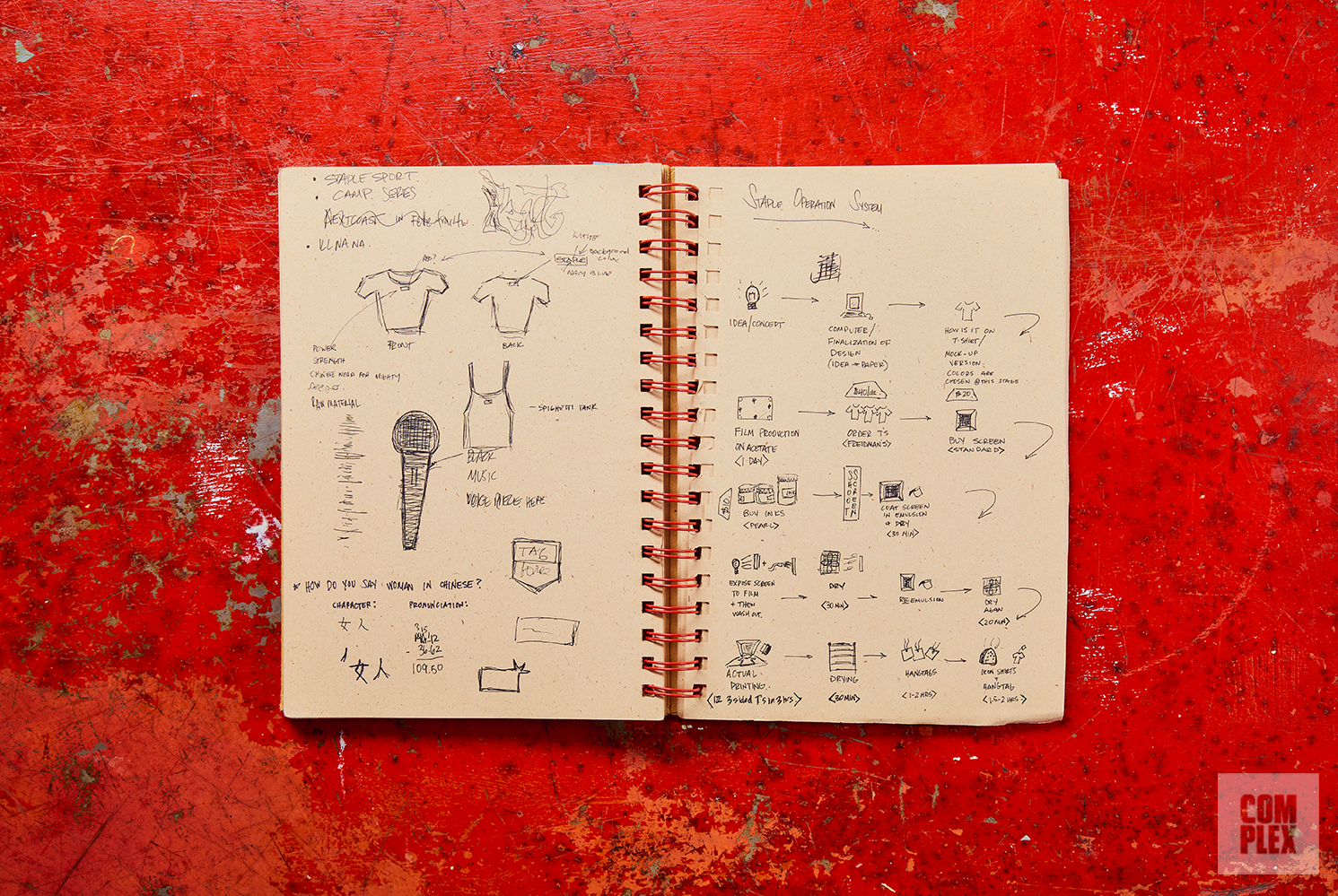
This sort of shows my thinking and my process. I mentioned a little bit about how to make a tee with the silk screen, but what I did after is I started to perfect that process. I wrote it out, pre-internet, pre–Adobe Creative Suite, pre–Apple Keynote. I wrote out a step-by-step process on how to make a shirt with an illustration on paper so that I could always remember the steps. I think I had the foresight in case I ever got an intern. I’ve made a playbook, so that this is replicable and scalable. It’s not just all living in my head. I stumbled upon that as I was researching for the Rizzoli book and I was like, “Wow, this is like gold right here.” It took this meticulous level of detail to even just make one T-shirt.
The “Unite” T-shirt is one of the earliest T-shirts I did probably in the first two years of Staple. I like this because it shows the thinking behind how the T-shirt was made. I have all my original notes. I have the original notebook and everything that I sketched out. You can see the sketch, the meaning, and then the final execution of it. It just goes to show that even a simple T-shirt has a lot of thought behind it. On this one in particular, this one I did in response to when Rudy Giuliani was leading New York City. There were a ton of police brutality issues that were rising up in his efforts to try to “clean up the city.” And there was this one incident where cops literally sodomized this guy with a stick. They not only beat the shit out of him, but then they also sodomized him. And while they were doing so, they were allegedly saying, like, “It’s Giuliani time,” as if it was, like, a new regime. So I did this shirt and it looks like it says, “Unite,” but I hid characters within it so that it says “Giuliani time” as well. It’s in the colors of the NYPD. On the back was a baton and it says, “Your tax dollars at work,” underneath. So you could literally wear this shirt right up to a cop’s face and he’ll think you’re pro-us, but then it’s actually, like, subversive because it says “Giuliani time.” So I love that. When done right, the power of the T-shirt as a medium for spreading messages is super powerful. You could be in someone’s face and loud and really obnoxious about it, or you could be sort of cunning and underhanded and covert with it. That’s what I really love about that.
Staple Ads Featuring Mos Def
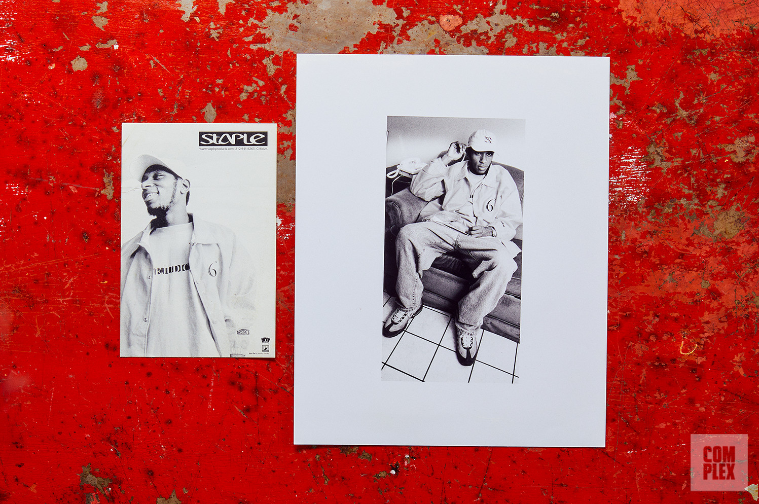
This was done during my time at Rawkus. Mos Def was a rising MC. He had just done his first album and then he did Black Star and he was always around the Rawkus office. And I had my little burgeoning, like, line of six T-shirts. And I was like, “Yo Mo, would you be down to model some of my shirts?” And he was like, “Yeah, I love it.” And I was like, “Alright, cool.” And he is like, “Let’s just do it right now.” And there was a photographer from Rawkus there. Those shots were done in the lobby and elevator of Rawkus. That’s just how it was in the ’90s in New York City: Just run and gun, see what you can get. And now I have one of the greatest artists rocking Staple in my earliest campaign. Like, right now a brand couldn’t pay Yasiin Bey to do a campaign. You know what I mean?
PNB Nation Stickers
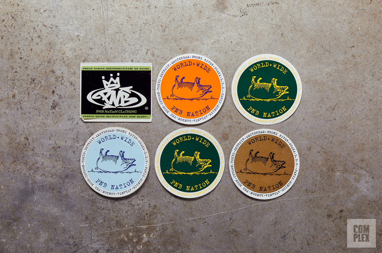
Oh, PNB Nation was early, early, early. Like, if I’m generation 1.5 in streetwear, that was the generation of streetwear that was before me. That was the ground floor, ground zero, of street culture, and PNB Nation was one of the forefathers of streetwear culture. I managed to score an internship at PNB Nation. That changed my life because that made me realize that this could actually be a career choice. Whereas I just sort of assumed that everyone who had a streetwear brand before that had some other form of income and some other way of living. How do you make a living selling 12 shirts at Union in SoHo? That’s not really a living, you know? But when I saw PNB, I was like, “Oh wow. There’s four guys here and they have families and they’re making a living. Maybe if I started a brand, I could actually make a living just doing this without ever having a 9-to-5 job.” I’ve worked in many, many shitty part-time jobs. Not that shitty, but you know, hour-to-hour jobs. But I’ve never had a career, like a 9-to-5 job, to this day. And I think it’s because of what I observed at PNB Nation.