

UPDATED 1/6/21 11:02 a.m. ET: Ryder Ripps, whose Instagram and Twitter accounts are now live again, has—as expected—been outright confirmed by the CIA as having nothing to do with the rebranding. In a statement to Exclaim, a spokesperson said Ripps "had absolutely nothing to do with our website redesign."
In a tweet shared early Wednesday, Ripps boasted about his trolling:
See original story below.
Assuming you don't follow the CIA on Twitter or elsewhere, there's at least a marginal chance you missed the government agency's recent rebranding, complete with a new logo. The response to it all, as you may have guessed, has largely hinged on design-related dunks tied to the agency's history.
Without going as deep as this fairly comprehensive Ad Age rundown, let's just note—for example—that the new logo does indeed resemble one you might see on a pre-pandemic Instagram post from a friend begging you to show up for their new two-piece band's show at the Laughing Lantern or whatever for, like, eight dollars.

Artist Ryder Ripps, whose other recent clients include Travis Scott and Grimes, eventually took credit for the rebranding effort, though the veracity of that credit-taking has since been brought into question by Ripps himself.
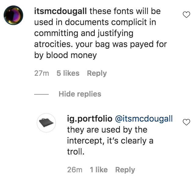
Ripps has been responding to criticism via his Twitter and Instagram presences, perhaps most notably telling one commenter in a since-deleted post that the involved fonts are also used by The Intercept.
"It's clearly a troll," Ripps said on his @ig.portfolio account.
Early Tuesday, he shared a pair of tweets in which he stated "thinking is not as fun as rock-throwing" and criticized people for giving the CIA attention by continuing to tweet about the rebranding:
Per an Associated Press piece from Monday, the aesthetic overhaul is part of a new website aimed at diversifying the agency.
At any rate, people have indeed shared a litany of CIA rebranding reactions in recent days: