Image via Complex Original
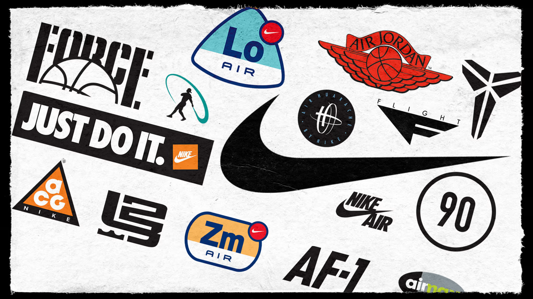
The Nike Swoosh is a logo legend. And while the Swoosh has stood as one of the world's most recognizable logos for nearly 50 years, Nike's mark on sportswear iconography offers one of the richest of any brand. Think Jumpman, Swingman, and hundreds upon hundreds more.
Nike's logo library extends far wider than the Swoosh. The brand has created a bounty of logos for its products, some obscure (the 1990s were the heyday of logo creation and hundreds were made just in that decade alone) and some iconic. It has built logos for shoes, events, athletes, and partner institutions (think: University of Oregon). The Department of Nike Archives has chronicled much of this history. Below are some of the most memorable logos from Nike's catalog.
Blue Ribbon Sports
Even before there was Nike or the Swoosh, there was Blue Ribbon Sports, the first iteration of the sportswear giant. The first-ever Blue Ribbon Sports logo came in 1967 as a simple horizontal script font. It was, of course, done up in blue (it wasn't just a clever name, after all). Soon thereafter an interlocking letters design became the corporate logo until 1976 when the company was still transitioning to the name Nike.
The Swoosh
The history of Nike's original logo is well known. Coming off the Blue Ribbon Sports days, co-founder Phil Knight's newly named Nike needed an official mark. Portland State University graphic design student Carolyn Davidson created the Swoosh, originally dubbed the Stripe when it was created in 1971. With Nike script lettering beneath, the combo held steady until 1976, when Nike changed the font to Futura, which remains today. The only other change to the logo came in 1995, when Nike dropped the lettering altogether and switched the "warm red" to orange, the color of the brand today.
Sunburst Design
In 1976, Nike offered the first fresh take on its own branding. Nike's first employee, Jeff Johnson, created the Sunburst logo, a design finished off by Geoff Hollister. The mark showed up on track apparel aplenty, but never truly caught on in a major way, even if it has remained part of Nike culture—at least on and off—over the years.
Athletics West
The original Athletics West mark, designed by Tim Ferguson, a local graphic artist, included a wordmark font named Axemen after the mascot for South Eugene High School. Debuting in 1977 for the track and field club, the colorful mark included a singular tree and also purple mountains topped with snow. Subsequent designs kept the wordmark, tree, and mountains, but changed up colors and placement.
Nike Air
In 1982, the debut of the Nike Air logo came three years after the technology debuted in the Tailwind. The logo started appearing on the tongue of all shoes featuring the technology and grew so popular that it moved to the heel tab—sometimes quite prominently—in subsequent years. Some of Nike's most ubiquitous retro shoes feature this mark.
Air Force 1
1982 brought another famous Nike logo for the debut of the Air Force 1, which started a logo family that would grow rapidly over time. Nike claims the Air Force 1 to be their most popular shoe of all time, and the logo has moved well past footwear to apparel. The logo family grew, too, with the Nike Flight addition coming in 1987 as Nike created Force for large basketball players and offered Flight for smaller players.
Jordan Wings
Michael Jordan has had a profound impact on logo design. In 1985, his legend kicked off with the Jordan Wings logo. Shortly after meeting with Jordan's agent, Nike creative director Peter Moore sketched the Wings logo on a cocktail napkin. He worked on the sketch on a plane on the way back to Portland and had it ready to go by the time they touched down in PDX.
Force
As Nike started to differentiate its basketball line, choosing Flight and Force as the two distinct elements, the 1987-created Force logo had a bold, big feeling to coincide with the type of player meant to wear those shoes. The original logo included a basketball at the forefront with the strong wordmark in the background. That would change over the years as the Force branding became more popular over time.
Jumpman
The Wings logo adorned the first two Air Jordan models before Moore decided it was becoming too juvenile for the sophisticated-dressing Jordan. Moore famously traced a Jordan pose seen in a Nike poster into a logo. The Jumpman logo was born. That 1988 creation was Moore's attempt to create a symbol that people would recognize immediately that could begin to stand for his new style.
All Conditions Gear
The All Conditions Gear logo appeared in 1989, using triangles, the international symbol for warning or danger, to bring to life the brand's first outdoor footwear and apparel line. A 1996 update from designer Michael Hernandez turned those triangles into a pair of lungs, one of the most iconic logos from Nike.
Image via Nike
Just Do It
The Just Do It logo, created by Ron Dumas, first appeared in 1989, giving graphic identity to Nike's most recognizable brand slogan. The basic design and boldness of the font, coupled with the marketing know-how of the brand, elevated a simple design to global status, whether seen on television commercials or across apparel.
Bo Jackson
Multi-sport Nike athlete Bo Jackson is more famous for the "Bo Knows" slogan, but he also had his own brand mark. The large 'O' with a capital 'B' off to the left side was a change from design for the company and brought in a new wave of colors.
Flight
While the first use of Flight in a logo series actually appeared in 1989 as part of the Jumpman Flight logo, the Flight script took on its own form in 1989. But it was really the 1991 Flight logo that took a singular departure from the light Flight script of the years past by making the Flight wordmark smaller and erasing the script, placing it all atop an airplane-inspired and stylistic oversized "F."
Challenge Court
Designer Tim Andrich created the first Challenge Court logo, for Nike's tennis line, in 1989. His 1991 revamp, which was used for Andre Agassi's gear, was a happy accident. Andrich was using a tech pen, a popular tool at the time, for drawing, and the inky lid slid across the paper, making a blob. He thought it was a cool mark, tore out the paper, and put it on his desk. "Then we had [a meeting] and I came back and I saw the piece of paper sitting there, and it looked exactly like a tennis ball," he says. "So, I blew it up on the copier and then turned it into this logo. For the most part, I didn't change anything at all."
Air Max 93
This Air Max logo debuted in 1993 and started a long line of Air Max logo designs. The original design offered a black background with the bold "AIR MAX" wordmark in grey and neon over top. This was the backbone of future iterations of the design, and the color of the logo became synonymous with product.
Diamond Turf
Deion Sanders played two sports, so when Nike wanted to give him a logo for use on the Diamond Turf line of cleats in 1993, they had to tie in both to the design. What resulted is a super-busy logo that features his uniform numbers, 24 and 21, along with a goalpost and home plate. The logo was first seen on the tongue of the cleats.
Air Huarache
Designed by John Norma, the original Huarache mark is highly regarded and still works today. The 1993 circular mark uses words to ring a futuristic design inside. Updated later to let the wave-like bends stand on their own, the Huarache mark offers a unique perspective within the Nike product designs.
Cross-Training
Used throughout the mid-'90s after debuting in 1993, the Alan Colvin-designed cross-training logo is a distinct departure from the original logo for cross-training from 1990. When Nike coined the term, it found it impossible to trademark words describing a newly created type of exercise. The original logo featured a design that put a focus on the word "training" while using small crosshairs for the "O" in "cross." The 1993 version stylized the "X" (very Huarache-like) and made that the focal point of the design.
Charles Barkley
Designer Donna Campa started merging the past use of athlete silhouettes with the contemporary use of initials when taking on this Charles Barkley design in 1994. The rectangle design for the Round Mound of Rebound included "CB" and 34 on either side of the Barkley silhouette.
Air Max 95
Created by designer Jeff Weithman, the 1995 mark has become one of the most popular Air Max logos over time. The oval design is a take on the original, becoming more football-like in shape and mixing the background of black into black and grey. The Air Max wordmark goes all lowercase, instead of all caps, and brings in both white and neon, keeping the color scheme from the original largely intact.
1 Cent
Anfernee Hardaway was better known by his nickname, Penny. And that singular cent became the backbone of this incredibly popular logo that adorned Hardaway's signature product for years. Launched in 1995, the incredibly '90s-styled 1 Cent mark was also in Hardaway's team colors. The 1 Cent lasted for years and is still talked about by designers today as a strong athlete logo that connects player with personality.
Swingman
Through it all, the 1998 Swingman logo of Ken Griffey Jr., designed by Kevin Plat, may stand the tallest of any 1990s logo. "You know it is Griffey because of that backwards cap," says Matthew Wolff, a former Nike apparel designer now working in the soccer design world. "The stance he is in really could be any baseball player, but that little bit of baseball cap peaking there, you know it is Griffey. That was his signature mark."
Air Elements
Nike released the family of Elements logos for the differing forms of Nike Air technology in 1999, around the same time Nike's original Air-Sole patents were reaching the end of their 20-year non-renewal lifespan. Nike designer Derek Welch based the concepts on an elemental point of view with a scientific approach. Once that was settled, the focus was finding new ways to tell a technology story visually. Ultimately, the designs kept the Swoosh attached to the marks so the Nike portion didn't get lost.
Image via Nike
Image via Nike
Image via Nike
Image via Nike
Alpha Project
Nike Alpha Project launched in 1999 using a five-dot insignia. Created by Ken Black, former Nike art director, the insignia was meant to drive home the idea of sophistication. The story goes that Black was behind a semi-truck and saw a reflected symbol at night that let him to create something that was more symbol than full-fledged logo. The concept was accepted and offered a visual anchor across an entire category.
Shox
In 2000, the Nike Shox logo offered one of the most roundabout logo creations. Greg Hoffman toyed with some original logo concepts, but Nike hired two different design firms to present ideas, coming up with about 150 different versions of a logo. Through it all, though, even with two firms working on the mark, the final design settled on was Hoffman's original. The most striking part of stems from a letter form that represents the technology so well.
Tiger Woods
The 2003 version of the interlocking initials for golf's biggest star became one of the most recognizable signature athlete logos. The logo was ubiquitous at every single appearance he made, catapulting that logo to prominence, not just in the golf community but worldwide.
LeBron James
In 2003, the first of what would be many LeBron James logos appeared. They all play off the theme of being a king, whether using crowns or lions. Wolff, the former Nike apparel designer, says the "strength and symmetry" of the James mark has allowed it to grow with the player.
Total 90
Sometimes a logo can work so well it backfires. The 2004 release of the Total 90 logo for the Total 90 III shoe became so popular in European fashion and casual shoe circles that it briefly catapulted Nike to top spot in global sales, and Nike responded by releasing all kinds of product variations. The popularity led Nike to do plenty of pinks and fancy colors, flooding the market. As the trend faded, Nike was seen more as a fashion company and had to reestablish itself as an on-field performance brand.
Serena Williams
Tennis star Serena Williams wasn't the first woman to get her own Nike logo—that happened in the 1990s with the likes of Sheryl Swoopes and Mia Hamm. The Serena logo, designed by Mark Smith in 2005, has adorned a variety of eye-catching apparel and footwear across the 23 Grand Slam titles won by Williams. The most common location for the highly stylized and ribbon-like "SW" has been the tongue of the NikeCourt Flare shoes worn by her.
Kobe Bryant
The first-ever logo for Kobe Bryant was actually his signature in 2006, but later that year Tom Luedecke, who left Nike for Under Armour in 2013, created the mark that has stood since. Looking for a symbol of Kobe's personality and style, Nike design legend Tinker Hatfield and Luedecke worked on a mark that began as backward and forward Ks laid on top of each other. "If you actually look at it, there's a 'K' in both directions like an anagram," Hatfield says. "And it was what we thought was aggressive and gladiator-like."
Image via Nike