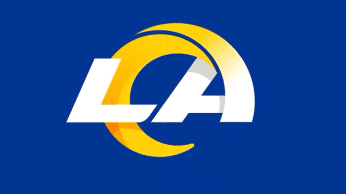
On Monday the Los Angeles Rams revealed a new logo that's intended to, once and for all, free them from their flyover country nightmare that was a 20+ year run in St. Louis. The logo, which came about after years of thought and planning (not a typo), comes with a color change that is *looks at image* very subtle. Specifically they went from navy blue to royal blue, gold to "Sol," and white to white.
"We always looked at blue and yellow and white, we looked at a wide range of things around that as accent colors," said the team's chief operating officer Kevin Demoff about the scheme, according to ESPN. "But at the end of the day, that was one place we knew our fans weren't going to compromise."
Here's the official reveal, which is markedly different from the leaked reveal that happened a few weeks ago when some New Era NFL Draft hats spilled onto social media. We'll talk about that after you watch this:
And here's an image of the secondary logo that's a bit Texans-ish. This one looks better:
Speaking of that leaked reveal, which featured one of the same logos but had a different color scheme, Demoff says the team was caught off guard when it was shown to the public. He shares that the franchise was angry because they specifically rejected it multiple times. He also agrees with the fan consensus that the logo was pretty ugly.
Decide if you agree:
Speaking of what fans think, here's what those who saw the actual logo (and felt at least strongly enough about it to type a few words and post) had to say about the official emblem marking the team's rebrand. Most of these seem to be negative too.
Decide if you agree:
Everyone's ornery right now, and sports fans aren't always the most receptive to change, so we'll be sure to come back and update this post a few years down the road.
