This interview is part of a daily, week-long feature series where we asked legendary designers about their favorite rap album covers from the '90s.
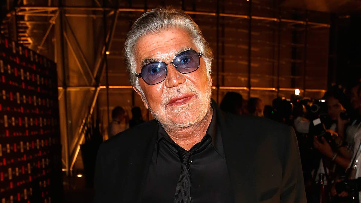
Lyor Cohen was matter-of-fact when he said, "Everything we do, we do it for the logo" on the Hip-Hop Honors awards show that commemorated Def Jam Recordings. The label's former president was reflecting on the 25 years Def Jam presided as the identity of hip-hop, dictating a musical and visual language that was authentic to hip-hop culture. In 2011, Cey Adams, Def Jam's former creative director, designed a comprehensive coffee table book that compiled over two decades of photos, album artwork, and stories behind every record released under the label for Rizzoli. Adams was art directing during the early days of Def Jam's inception.
Cey Adams has the credentials of someone who was literally on the doorstep of hip-hop. He wrote graffiti with a hand style you would give your left arm for, and he also painted fine art pieces. Adams lived just a few doors down from the late, great Notorious B.I.G. on St. James Pl. in Brooklyn, during which he founded The Drawing Board design studio at Def Jam with his partner, Steve Carr. Together, their creative team was a factory of artwork and logos for the label’s marquis talent: LL Cool J, Redman, DMX, and the list goes on. With ‘90s rap etching its place in music history, and with every year getting arguably better than the next, credit has been owed to visionaries like Cey Adams. Bad Boy Records and artists like the Beastie Boys also turned to Adams and his friends for work, which he discusses when he names his Cey Adams' 10 Favorite Rap Album Covers of the '90s. Some of his extended stories about Redman’s video game character and working with Diddy from the salad days of Uptown Records are so damn good that we're giving you the extended interview. Respect the architect.
Why did you choose Bobby Digital as the quintessential illustrated rap album cover from the '90s?
Initially I would have said EPMD, but I think EPMD’s Business as Usual came out in the ‘80s [note: It came out in 1990]. We were actually the first ones to use Bill Sienkiewicz, and he ended up doing the Bobby Digital cover. But I thought it was so cool that we paved the way doing illustration; then the RZA decided to do a cover like that, as well. I thought that was a cool thing, because in hip-hop, it wasn’t really happening so much. N.W.A. did 100 Miles and Runnin', and EPMD was even before that. It was a hard thing to get past the powers that be back in the day. Everything was photo-driven.

RZA, Bobby Digital

EPMD, Business As Usual
We worked with him on a couple of things. He did EPMD first. Then we came back, and he did the Fear of a Black Planet cover with us. He ended up doing illustrations for Public Enemy's Muse Sick-n-Hour Mess Age. We ended up using him a couple of times. The stuff that he did for Public Enemy was mostly on the inside, but he did a couple of really beautiful paintings that got double-page ads in Billboard. I wish I knew somebody who had a copy of one of those magazines, because they were really beautiful, gatefold double-page ads.
Public Enemy, Fear of a Black Planet
Public Enemy, Muse Sick-n-Hour Mess Age
When magazines were running music ads, they were just as iconic as the album covers. They were like alternate versions of the album covers.
Tommy Boy was notorious for doing full-page ads for one artist. They would be image ads. At Def Jam we always wanted to an image ad, but Def Jam was also always about getting more bang for their buck. So we’d always have to gang up like 10 artists on a page. Some of those back issues of The Source would have a compilation of a bunch of different artists. When we did Fear of a Black Planet, we finally got to do an image ad.
Just one last thought on Bobby Digital. I don’t remember any other albums before it that paid homage to Blaxploitation films of that era.
Not at all. No, not in hip-hop at all. This was being conceptual in the ‘80s. It was still the stereotypical guy in front of a brick wall, with the ice grill, looking like he was gonna kill somebody. It really was to our credit that we were able to push some of those things through. They just didn’t understand how you could sell records without their image being on the front cover. And unless I’m wrong, Fear of a Black Planet was the first time we ever got to do strictly an illustration that didn’t have the artist’s picture on the cover. It was a very difficult thing to do. You had EPMD that was an illustration of the guys in the crew. Fear of a Black Planet was just this image.
What album covers did you want to illustrate?
The EPMD one we got to, but it was really more out of necessity, because the guys wanted to do a photo session of them being chased through a swamp with dogs and police and helicopters, and we didn’t have that kind of budget. The only thing we could do was an illustration. And so it really came about by default more than anything. We were just trying to come up with new ways to push the envelope.
We did end up doing one with Warren G for Look Over Your Shoulder. It was an oil portrait by a guy named Daryl Zucker. He was an art student, who went to school with my buddy Steve Carr, my partner at The Drawing Board. He thought it would be really interesting to do an oil painting. Again it was something we had to convince everybody at Def Jam and Warren G to do, because nobody had done that before. "Why do you want to do an oil painting? We can just take a picture." And we thought, "We're artists." Our goal was always to figure out a way to elevate the art and do something interesting to stay engaged, because we did tons and tons of covers. How many photographs of artists can you do?
Warren G, Look Over Your Shoulder
There is such a thing as “too many.”
Not to knock anybody else, but we were always interested in using best-in-class artists when we did our work. Whether it was a photographer, an illustrator, or a painter, it was always about using people who were really talented and making a mark in their particular field. Bill Sienkiewicz was an amazing illustrator—he did all of the Batman covers. Daryl Zucker’s done all kinds of amazing work after he worked with us.
With The Roots' Things Fall Apart, they put their faces on their albums for numerous albums before that, and here they are going more conceptual. How was that influential?
There are a few things that are unprecedented about that album design. For starters, a hip-hop artist not putting their image on the album cover was kind of [tough].
The Roots, Things Fall Apart
And it’s risky.
It certainly is, because the industry is not known for doing things like that. That’s the first thing. The second thing is that trying to get multiple covers was virtually impossible in hip-hop because of budget restraints. Kenny Gravillis, who used to work for us at The Drawing Board, had moved out to L.A. and started working for MCA on the West Coast. He ended up convincing the guys that if they just went with black and white, it would lower the cost. So in theory, it wouldn’t be any more money than it would be to run a color cover. I think he got the printer to do a gang run, and they made it cheap enough to be able to do five covers.
He basically came up with a concept and solved a problem when they started to debate about why this was too expensive. The cool thing about the guys in The Roots is that they were always interested in pushing the envelope and doing something interesting every single time they released a record. It was to Kenny’s credit that he was working with a band like that, because not everybody cares about that, and they’re not always willing to fight for it. In addition, having those iconic images on the cover—I mean some of them were pretty painful to look at—was still an interesting turning point in the culture, because it showed that we can do things that are conceptual, just like the rock and roll boys, and people do care, and they will pick up the record. And that was to my knowledge the only record The Roots had a hit on.
And it won them a Grammy.
Yeah. Case and point. There you go.
What’s your take on using photography vs. illustrations—something completely abstract?
Something conceptual, for example, is Jay Z’s The Blueprint 3. That was a difficult thing to do. You need the support of the artist. Artists have egos, and their egos are attached to self-gratification. They always want to see their image on the front. It’s very difficult to get past that. It almost has to be their idea to a certain degree, so we didn’t really get the opportunity to do that, ever. I was always open to the idea. It just never got past people.
Jay Z, The Blueprint 3
Were there ever cases when you thought, "This is not working with this album cover," with the way the photos came out? The retouching isn’t working, etc.? Were you ever stuck at any point and then you had to go more conceptual?
Yes, that happened with Slick Rick's Behind Bars. We had a couple of photographs from a past album that we had to transform so it would look different. We ended up doing a three-dimensional illustration. He didn’t really give us too much trouble, because he was in jail and didn’t really have any say. The record company was just happy that we came up with something strong. It ended up going through.
Slick Rick, Behind Bars
So we are switching Redman’s Dare Iz a Darkside for…
I wanna switch it for Doc’s da Name 2000. That was another turning point, because we made the character look like Super Mario—a video game. Nobody had done that before. That was the benefit of the way Def Jam worked and the relationship we had with the artists. If it was a good idea, they were gonna get out of the way and let it breathe. I’m looking at this thing now, and I’m so proud of it. All of the elements involved are really well done. This was at a time when computer technology wasn’t nearly as advanced as it is now.
Redman, Doc’s da Name 2000
I remember we hired this guy named Brad Digital, who was basically a video game geek. He came in to the office and brought this special PC in. He rendered that stuff in like a month and a half. He was one of those guys who, if you let him leave the office, he wouldn't ever come back. This was the beginning of the vinyl toy boom, and he was doing all these other things. If you know anyone that has the vinyl, it’s a really beautiful piece of artwork in and of itself. Every angle on that thing was done so well. It looks really beautiful. The colors are so nice and rich. If I’m [not] wrong, it was one of the first times a hip-hop artist created a three-dimensional character that they ended up really identifying with and sticking with like a mascot, to a certain degree.
It carried on with Red’s albums after that.
Granted the execution wasn’t as creative with some of those.
No it wasn’t.
It was nice that we had an opportunity to do what we wanted to do. He was one of those guys who understood the value of having a great logo. He used it every time. The records of his that I worked on were always consistent, in terms of the logo being used.
Did you design one of the early Redman logos, where he was a baby with a skully on in a stroller?
That was created by the artist Todd James.
Oh, Todd did that?!
Yeah Todd did that.
Wow I didn’t know that.
Yeah, he is a buddy of mine from when we were teenagers. I’ve known Todd since he was 13. He was a graffiti writer back then, and I commissioned him to do that. It was just one of those things where we came from the same neighborhood. That was one of the first things he did in the business.
That’s so slept-on as far as illustrations that are associated with Redman. It was always so small in the album credits, and when I thumbed through the book Def Jam Recordings: The First 25 Years of the Last Great Record Label so many times, I couldn’t find it.
I think that when I was working on the book, I was trying to find it. But then we were on deadline, and it was one of those things I just forgot about. I just couldn’t find it in time, and they were rushing me. I thought, "I’ll just get it on the next one."
Mary J. Blige's What’s The 411? is a unique choice, because it’s more R&B, but it’s definitely a hip-hop album at its core. You designed the logo, too, right?
The reason why I'm including it is because I just like the mystery in the photography. Out of all of Mary’s previous records, that was the first one where she was mysterious. It wasn’t high gloss hair and makeup. She was really a B-girl at that time.
Puff basically created everything that you are looking at. For lack of a better of term, he practically art directed the record as far as the visuals go. The record is really beautiful in how it’s a simple image with a smoky hook to it. Her hat is pulled down so much that you can’t see her face. When I think about it, it’s really, really in line with some of the early, sort of "gangster" images rappers had.
Mary J. Blige, What’s The 411?
Mary was down to do whatever we thought worked for the record, and she didn’t get in the way one bit. To this day, she has consistently used my logo over and over again, which is one of the things I enjoy about working with somebody like her. People think that’s her signature.
At that time, I thought that’s how Mary would sign her name on autographs.
That was the idea in creating it. When I looked at that, I thought, "She’s R&B. What can I do to distinguish her from the hip-hop artists?" I just looked at Anita Baker and all those traditional R&B records, and I thought, I’m gonna learn how to do hand-lettering that looks like that. For all the R&B cats, I just started learning how to do a soft, delicate sort of signature. Years later, when Puff did Sean John, he was like, “Yo, I want a logo similar to that Mary thing you did.” So I had to create the Sean John logo to mirror that. That’s where it comes from.
What’s interesting about that handstyle is that it has a personal touch, specifically with an R&B record where you’re getting something that’s heartfelt and a little more personal.
Yeah, for me, if there was an opportunity to reconnect with my graffiti roots and work with hand-lettering, I'd take it. I had to make sure that my hand skills were still up to par, because once I started doing design on the computer, everything was just type-driven. Working with logos with block-letter type—everything had to be big. I didn’t always get an opportunity to do lettering so I thought, "You know what, I’m gonna try to incorporate that into these R&B records when I get an opportunity," and it was one of the only times it was appropriate.
Did you ever have challenges in visualizing that title?
Oh sure. When I did that logo for example, I did no less than 30 versions of it. And then I would cut and paste them together so they would look like one complete signature. It was one of those things where I couldn’t always nail it in one take. I might have done 20 What’s the 411?s in different variations. I had to make sure the width was correct on each one. If it was something that happened over and over again with other artists, as well, I would just do as many Ws as I needed to until it looked right. I would cut and paste those things together, Xerox them, and clean it up with white-out so it looked perfect, even thought it was done by hand.
Cool. Tell me about Hello Nasty.
It was a real collaboration between me and the Beastie Boys. It was always interesting working with them, because they just had a different way of thinking. The other great thing about working with them was that you never had to worry about the record company or management getting in the way.
They were so smart at thinking outside the box. When we did that cover, as far as the sardine can, it seemed really absurd, but we found a way between Bill [McMullen] and myself to make it work. We spared no expense. It was during the early days of computer design; now you can do that stuff in Photoshop in no time. Back then we had to make a real live sardine can. We photographed them inside that, and then we superimposed the outside out and put the real can on there. So in the photo, they really are squeezed together in a can. I still have the contact sheets!
Beastie Boys, Hello Nasty
Which one came first, the design or the name of the album?
Oh, the name came much later. Originally when we were doing it, it was going to be called Another Dimension, and that was the working title up to print. At the last minute they said it was Hello Nasty.
I remember the promotional stickers. Was that your handstyle?
Yeah. Working with artists like that is the reward in itself, because you know they are gonna give you the space to do what you do creatively.
I definitely recognize that. What was it like designing The Notorious B.I.G.'s Ready to Die?
This one has been talked about so much that it kind of goes without saying. Again this was an opportunity to be reconnected with Mr. Combs. He led the way on this one through the whole thing. He decided that it was gonna be a baby on the front cover. He didn’t know that we were gonna make the type really small. The idea is that we wanted it to be delicate, because there was a baby as the subject. The title was so absurd that we didn’t have to hit you with these giant block letters. We thought we’d do something really delicate.
On the single covers we ended up going really large with the type. It was the exact opposite of what we did on the front cover. If you ever look at any of the singles on that album, they were all the same typeface. They were a lot larger to emphasize the power of the music and the image of a big guy.
The Notorious B.I.G., Ready to Die
“Juicy” was an example of the red fat lettering. There’s an alternate cover of Ready to Die, and it has Biggie on it, wearing all white, against a green background, and it just says "Notorious B.I.G." really big. Did you design that?
We did design that, and I think it was originally for the European release. I don’t remember if it was even released in the States. Once upon a time I had a copy of it. But again, embarrassing at it is, I never imagined that any of this was going to be important a dozen years later or even 20 years later. So here we are talking about this stuff. It’s just hysterical to me that it’s all becoming so important, one record after another.
What was it like working with B.I.G. and Puff?
I didn’t know B.I.G from a hole in the wall, but ironically, I did know who he was because he and I lived on the same block. He lived two doors from me on St. James Place. I lived in the same building as one of the Junior Mafia guys. He was constantly dealing from my doorstep.
It was ironic that I ended up working on this record. I remember coming home from work in the evening, and they’d be basically blocking me from getting in my apartment. You know, it was never a problem, but I’d have to be like, “Hello, I’m trying to walk here.” I at least knew who they were, but I didn’t even know he was a rapper at the time. I didn’t know he was a rapper until I saw him in Midtown with 2Pac. I was like, wow, that’s that guy from my neighborhood up there with 2Pac. After we did the record, it all became clear, and it became clear to him who I was.
What was it like working with Puffy?
I just recently came to New York after working with him at REVOLT. I’m not sure if you’re familiar with REVOLT.
I’m very familiar.
I’ve known him for a long time. He’s always been a very focused individual. Even then he was focused and driven. We speak in a shorthand that not a lot of people have with him. He’ll come in, and he’ll say, “I want you guys to do something and make it hot. Do something similar to what you did with this particular record.” He knows when you're doing what you’re supposed to be doing, and he gets out of the way. If you don’t know what you’re doing, he’ll micromanage you. I’ve never had to bump heads with him or anything like that. At the core, I’ve learned he really is an amazing individual, and I never bet against him.
Starting with the logo and typeface of Fear of a Black Planet. HAZE did that, right?
He didn’t technically design the Public Enemy logo, but he cleaned it up. Chuck came up with the idea that the type was gonna be that sort of military look, but Eric was the one who fine-tuned it and made sure that everything was drawn perfectly. But it was Chuck’s vision. Let’s face it, even if Chuck did the pencil sketch, it could have looked completely different. It might have been a lousy version of it. There are all kinds of poorly executed logos that aren’t straight. You can look at that spread I did in the Def Jam book and see that logo larger than life. It's beautiful and as clean and well-crafted as possible. I could show you other bands and logos that, when blown up, are obviously just poorly executed. So that’s to Eric’s credit; he was a technician back when people were just doing things freehand.
Take me through Chuck’s design.
Basically Chuck sketched out the concept on a napkin. He had just gotten in from a flight, and he just said, "This is the cover." That's traditionally how he would work. He would come in to the art department and sit down with us to just brainstorm for a little bit. We had to find Pete Johnson, an illustrator who worked with NASA. Our idea was to find somebody who did illustrations for NASA, because they understand how space illustrations should be done—like how all the stars and planets work—to make sure that the shadows are done properly.
And it’s accurate.
That’s how we ended up doing it. If you go to his website, you can see all these other space illustrations. Again, it was just the first time that we got to do a conceptual cover and didn’t have an artist image on the front. Pete Johnson is really image deep. He is a member of the prestigious NASA Art Program. I never met him in person. We only talked on the telephone a bunch of times. When we were doing the Def Jam book, we had to contact him again to get new hi-res scans of that. When we did Fear of a Black Planet, 20 years ago, the files that we used were much smaller. He had the original painting and had to send us a brand new scan (that we had to pay for) which was really, really hi-res. You can see how big that illustration is in the book, even though we did a 12-inch cover for Fear of a Black Planet. It was just a different time, and the files can be much bigger now.
It has to look better on a screen.
Yeah, it’s just interesting that he was the right man for the job. He didn’t really know who Public Enemy was, and he didn’t know how popular they were, so he wasn’t overly excited about doing the job. Now it’s on his website, and it says, "Voted one of the 50 greatest album covers ever." He sells limited edition prints of that illustration, and it’s called Nemesis. I believed he named it when he was doing it, before the album was built. He knew what the title was, because he was showing the planets being eclipsed. But I didn’t know it was named Nemesis until much later.
Next, Geto Boys' The Resurrection.
I didn’t really do a lot of records that weren’t closely affiliated with Def Jam and Bad Boy. I got this call to work with the Geto Boys for their reunion project. I was really excited about that, because I always loved the Geto Boys' “My Mind’s Playing Tricks On Me” and all that, but I never had any relationship with any of the artists from the Dirty South.
I thought it was a huge honor to work with them. They flew me out to Houston, and I met with Scarface. He was basically the one in charge, and he explained the concept of the record. I just remember thinking they had a lot of respect for the work that I had done, but I wasn’t aware that other artists were paying attention. You kind of just have your head down, doing your job everyday, and even if these records are in stores, it had never occurred to me that other rappers were paying attention.
Scarface was really excited about us: “We do things a little bit different from you guys here.” And what I was trying to say was, "This was the height of the Pen and Pixel era."
Geto Boys, The Resurrection
Yeah I know who they are.
My other thing to them was, if I work on this record, I really wanna do it in the style I’m accustomed to working in. I didn’t wanna do something that looked like it wasn’t coming out of our studio. They basically didn’t get in the way. They gave me the space to do what I do, the way that I do it—granted it was their concept. That was fine by me.
They provided you with those photos to use?
No, I went out there, and we discussed it and photographed it. Them being in the coffins and all of that was really creepy stuff, to be honest with you, but I didn’t have to get in the coffin. It was amazing to see the lengths these artists would go to express their creativity. It’s fun when you have artists who have the freedom to do exactly what they want to do. They were another one of those acts where nobody told them that they couldn't do this or that.
Can you name the actual locations in the black and white photos?
One of them is the outside of a church. They really loved the way this church looked. The other thing is a shack of this old house. They really enjoyed that, as well. I was trying to figure out a way to incorporate all of those things. So at first it was gonna be just the coffins, and then I thought, that’s not gonna be strong enough, and it’s gonna be a little bit scary, but then the church didn’t really convey the message that they wanted to convey either, so we ended up combining all three of them. They agreed that was the best.
Heavy D, Blue Funk.
This is gonna sound funny. At the time, I was working with Bad Boy a lot. Heavy D was a huge star when Mary J. Blige’s What’s the 411? record came out. My goal was always to work with Heavy D. So Puff comes to me, and he says, “Hey, I want you to work on my Mary record.” And I said, “Yeah, but you said I was going to get to work on Heavy D.” Him and Andre Harrell were like, “That’s gonna happen, but you need to do this Mary record.” You would have almost thought it was a burden working on Mary, because I’m like, "I wanna work with a real star—I wanna work with Heavy!" So I worked on the Mary J. Blige record, and I kid you not when I tell you that I tried to get through it as fast as I could, because I was so excited at the possibility of working with Heavy D.
I remember going to the recording studio to meet Heavy. When he played me some of the music from Blue Funk, I felt like I had arrived. He was such a cool guy, and we had these amazing conversations about doing all these different sort of things for the cover. We ended up going with a pretty traditional photograph that Danny Clinch took. At the time it was really just about working with him and vibing with him one on one, because I was so in awe of him, and he was a huge star at the time.
It's funny when you look back on it, in retrospect. That record ended up not being anywhere near as important as the Mary J. Blige record. You know how the rest of the story goes. It was a great opportunity to work with him. It's fascinating how these things happen. It’s like I was almost stepping over Mary to get to him, when the realer prize at that point was getting an opportunity to work with her, as well.
Heavy D, Blue Funk
Now this came came after doing the Mary album. Were you looking to carry your style elements into each work? Or did you try to reinvent the wheel?
Heavy has a logo, and so what I did was a variation on his logo. I always wanted to do something that would let people who were following what I do know that I had a hand in it. I would do this kind of hand-lettering. I would do it as often as I could, but I would mix it up so that it wasn’t always one record after another. From time to time I would introduce hand-lettering to a specific design depending on the last time I used it. Sometimes these records came out back to back, and at Def Jam, we were cranking these things out like water every couple of weeks. I never wanted two records to look similar if they might have been coming out at the same time.
When I was working on Blue Funk, I knew it was a Bad Boy release that wouldn’t coincide with anything we were doing at Def Jam, and it came out even after the Mary record. I made sure that the type was on an angle; it was a little bit thinner, and I used a different pen. You can look closely and see similarities in the hand-styles.
Is there an album cover from the '90s that you wished you designed?
I would have loved to take a stab at Nas’ Illmatic. I would have liked to take a shot at that. I do think that Nas was one of those artists who has ended up being really important. I was fortunate enough to work with so many artists who have ended up with iconic status, and he’s one of those artists I really admire. He’s a cool guy. I just think I could have done something interesting with it. When I see what they did, I just thought, wow, the ways I could build on it. I was very envious of that cover, because I like his logo a lot. I liked the way he used it, how he consistently stuck with the same theme, and how even if he kept changing it and changing it, it was always a similar sort of look. You could see the evolution over time if you put all of his covers together.
Nas, Illmatic
What are some of the basic things you learned in design?
Certain colors print really well, and certain colors print really poorly. Red is a color that prints really well, and blue is a 2D color to nail down. Over time, with the work I've done, you’ll see a lot of red. You’ll see a lot of black and a lot of white. Those are just colors that work really well, and printers can do a great job with them. That’s why you see a lot of red in advertising, because it always looks great. Whereas with blue, it comes out a little purple, and sometimes it comes out too gray. Red always pops. I've tried to work with warm tones more times than not, because I think it’s just easier to manipulate them.