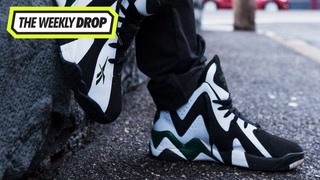
In 1994, Seattle Supersonics power forward Shawn Kemp was on the verge of superstardom. At the conclusion of the '93-94 NBA season, his Sonics lead the league with an impressive 63-19 record behind the thunder and lightning combination of Kemp and point guard Gary Payton.
With an increased profile came increased attention from brands and marketing execs. The signature sneaker concept was expanding, and Reebok realised the high-flying NBA All-Star on their roster could do more than push their their general-release Crossover or Blacktop. Decisions were made, and the concept for Kemp's Kamikaze was born.
Reebok designer Ricardo Vestuti was tasked with creating the sneaker for the dynamic power forward. The sneaker went through several possible names; Altimeter, Eliminator and Adversary to name a few, before finally landing on Kamikaze.
While the finished product – flashy, aggressive and brash – was a perfect accompaniment to the Reignman’s game, Vestuti admits he wasn’t familiar with Shawn Kemp at the time. The design of the Kamikaze 1 was in fact inspired by a Venezuelan visual artist.
“I began with some triangular upper graphic panels,” Vestuti told Complex AU. “The tread pattern, I remember, was based on a painting that a Venezuelan artist Anita Pantin made that had a crown of thorns. I liked that aesthetic because it looked like barbed wire, and I thought that had an outdoor hardcourt feel; concrete, steel, chain-link fences, and barbed wire, all design elements that spoke of the city. It was both edgy and religious simultaneously.“
With the design locked in, Vestuti worked with fellow Reebok designer Scott Hewitt on the OG Black / White / Green ‘Sonics’ colourway. Hewitt was at the time designing golf shoes but, shortly after working on the Kamikaze, went on to design sneakers for Allen Iverson.
The finished product, in black and white, was a unique offering in the early ‘90s, a time of wild geographic patterns and wilder colour palettes. However, for a sneaker with minimal Reebok branding, the monochrome finish proved a marketing masterstroke; it was instantly eye-catching on TV as Kemp made his way up and down the floor in nationally-broadcast games.
"This shoe was the first of the graphic, high-contrast shoe designs," explains Vestuti. "Once the shoe took off, the direction was established to take this visual direction for many of the subsequent shoes. This shoe was the form driver. It was the shoe that established a high contrast, graphic visual."
The following year the brand dropped the ‘Mobius Collection’, which rolled out in exclusively black and white offerings; the Shaqnosis, the Blast, the Big Hurt and the Kamikaze 2 – designed by Jonathon Morris – all adopted the monochrome, high-contrast, philosophy.
Kemp went on to battle the Bulls for the 1996 NBA Championship in the Kamikaze 2. When the Sonics fell short, roster moves were made, and Kemp was ultimately dealt to Cleveland in 1997. The glory days of Kemp and Payton alley-oops were gone, and the Reignman’s signature sneakers were discontinued.
While the Kamikaze line was short-lived, it is reflective of a wild time in Reebok’s design history. Kamikaze 1 designer Ricardo Vestuti recalls the time at Reebok fondly, adding “There was no design direction in this Reebok era. We made whatever we wanted, and there was no coordinated, singular direction. We all fed off of each other. We each had a particular style, and followed our own direction.”
Dropping around the same time as Steven Smith’s crazy Instapump Fury, informing the unique Mobius Collection, and setting the groundwork for Iverson’s Answer line, the legacy of the Kamikaze still lives on today.
Complex AU thanks Ricardo Vestuti and the team at Reebok for making this possible.

