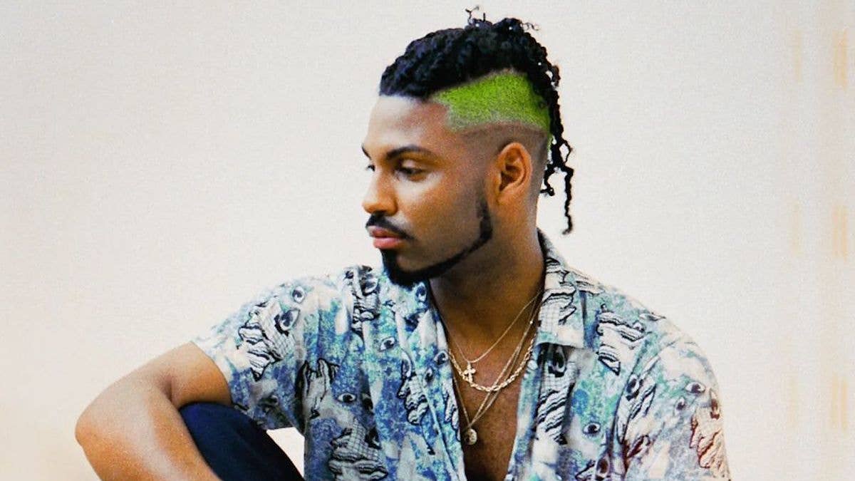
If you've seen custom hand lettering on a hip-hop album cover, poster, or tour visual recently, there's a good chance it's the work of Duong Nguyen.
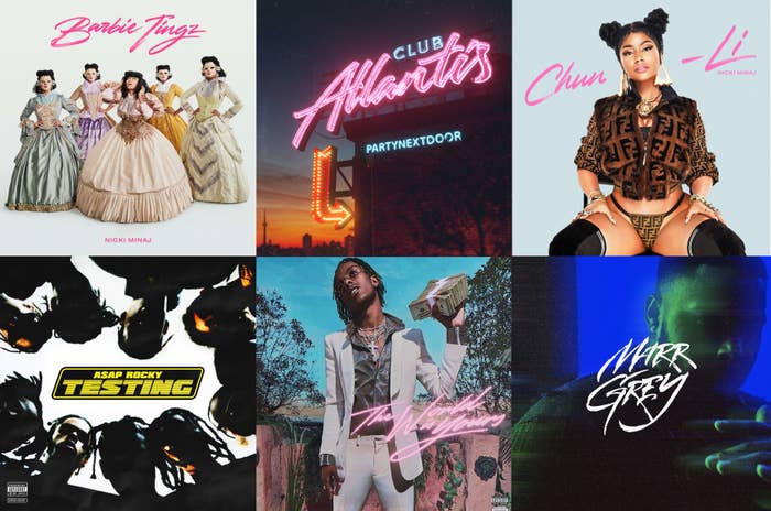
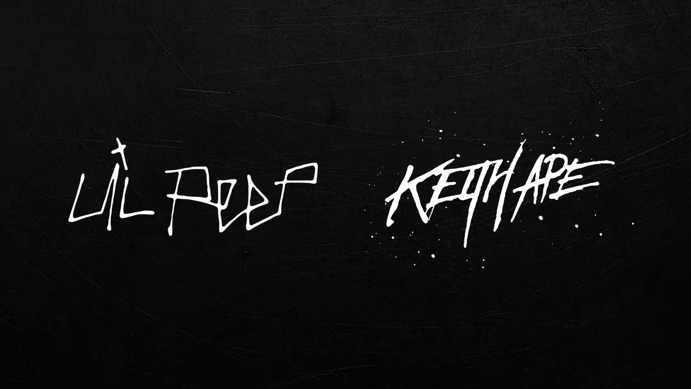
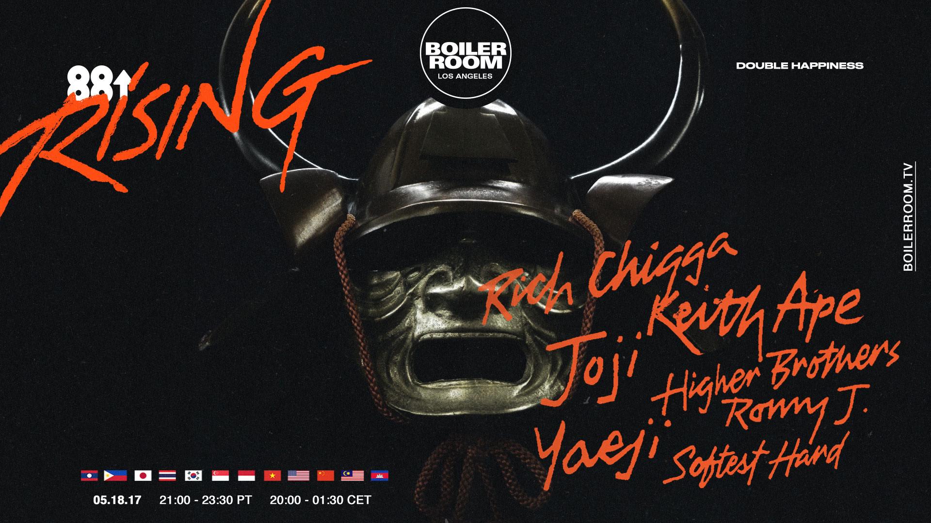
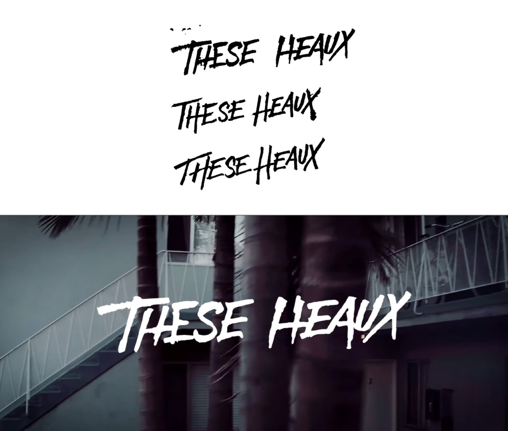
Over the past couple years, Nguyen has created custom type for artists like Kendrick Lamar, ASAP Rocky, Lil Uzi Vert, Nicki Minaj, Lil Peep, Rich The Kid, Bhad Bhabie, and the whole 88rising crew. Known for his lively style, Nguyen has become one of rap's go-to artists for custom type and his hand lettering brings a human feel to whatever project he's working on.
"People are realizing that hand lettering is a cool way to add personality instead of using a font," Nguyen says. Instead of slapping a regular font on an album cover, he prefers to pull out a pen and sketch out custom lettering styles for each project he tackles. "I like hand lettering because you're working traditionally with pen and paper," Nguyen explains. "There are so many types of paper and so many types of pens. Not all pens give the same finished product. If you work with marker paper and a brush pen, for example, you'll get a grittiness you wouldn't get otherwise. I always like the natural feel of pen on paper."
Hip-hop's aesthetic has grown and evolved from its graffiti-dominated beginnings, but Nguyen is keeping the human touch from those days alive with his hand lettering. We caught up with him to learn more about his background, inspirations, and artistic process. Continue for the full interview and see some of his work below.
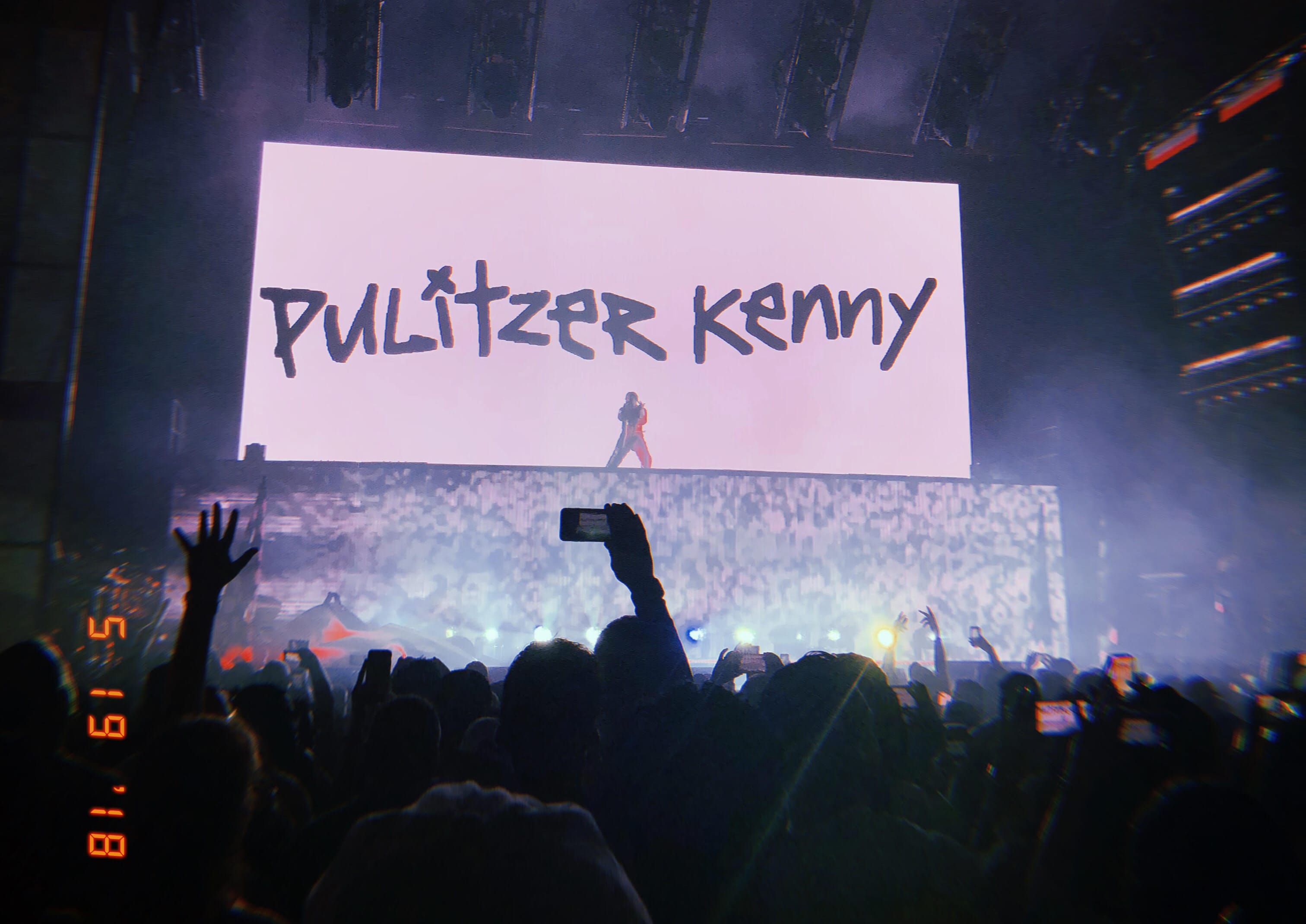
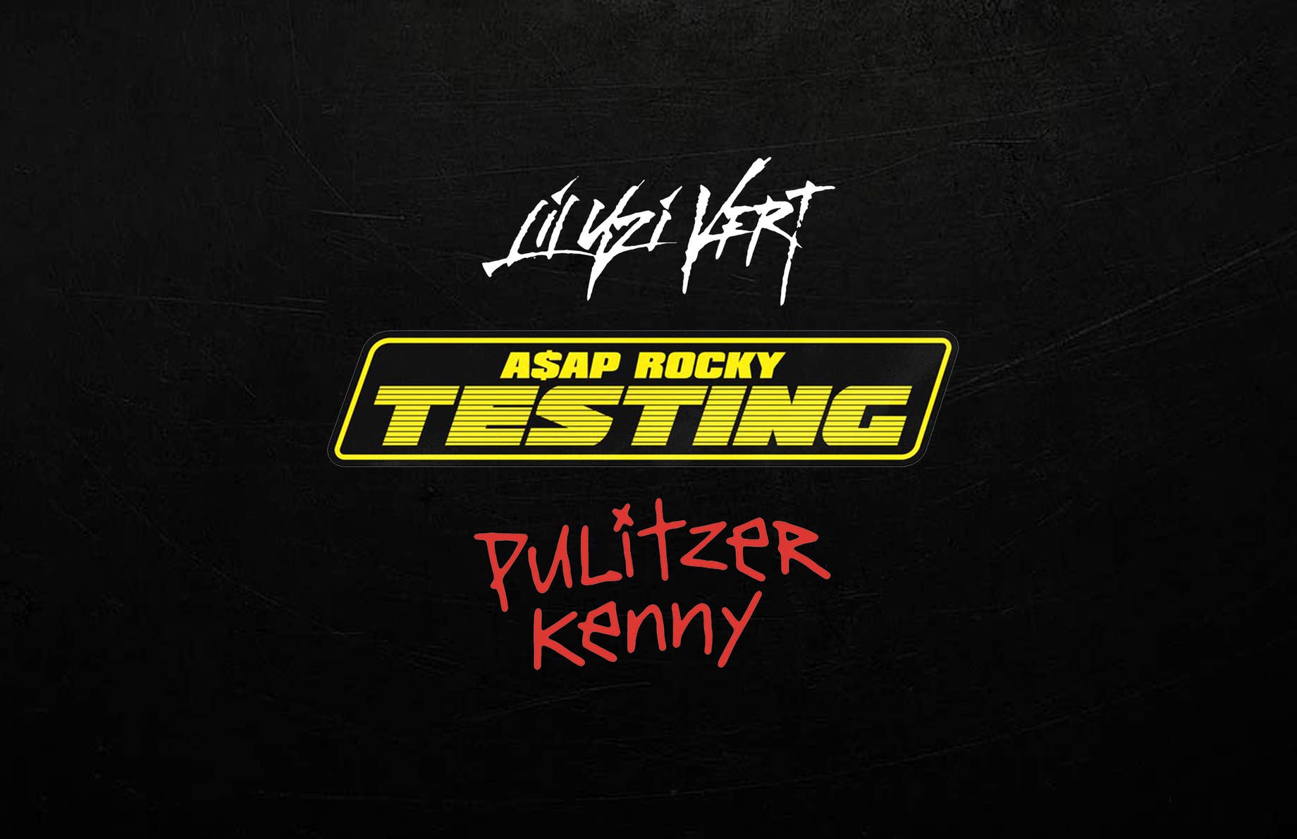
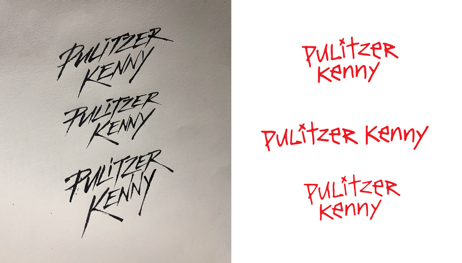
The guys who worked on Kendrick Lamar's new tour visuals told me you did the "Pulitzer Kenny" script.
Yeah, we worked on that the day before the tour started. Adrian just called me up and let me have a go with a first round. At first it was a more aggressive kind of type because I was thinking that would match his whole "Kung Fu Kenny" thing. Then he came back with the suggestion to do a child-like style. From there, I actually got inspiration from my own piece—the Lil Peep logo I did. I went for a crude look, as if a child drew it.
How did you first get interested in art and why did you focus on hand lettering?
When I was in sixth grade, I was really into graffiti. A lot of people who do hand lettering start with graffiti. Going into eight grade I got introduced to Instagram and the first people that I saw doing hand lettering were David Smith, Neil Secretario, and Matt Vergotis. David was the one who inspired me the most—especially his stuff with Benny Gold. I got super interested and would try to copy some of the scripts he did. Then I actually quit hand lettering for a while in eighth grade because I picked the wrong pen and it was super hard. [Laughs]. I was using a Copic Sketch marker.
I got back into it in eleventh grade, because I had a crush on this girl and wrote her letters, so I would practice cursive handwriting and different scripts. That's honestly how I got a foundation in hand lettering. After that, I went to art school for graphic design, but realized I didn't really like graphic design at all. I just liked drawing letters. That's when I started reaching out to artists. I was really into some SoundCloud artists in the electronic music world, so I just started lettering their names. Specifically Y2K and Manila Killa—they helped me get used to working with artists on projects.
I was a really big fan of their music and I love music in general, so I just wrote their names. They're electronic music artists, though, so they didn't really help me cross over to the hip-hop music world that I'm working in now. It wasn't until I worked with Bryan Rivera and Joe Perez on a big project that I got connected with the hip-hop world. Bryan got me into a Skype call with Travis Brothers and he ended up connecting me with people like Rich The Kid and 88rising.
Do you have advice for kids trying to follow your path and do something like this? How did you do it?
I looked at other hand lettering artists and tried to copy what they did, just to get the feel of it and a foundation for how to work with a brush pen. After that, I started thinking of my own ideas. I started to learn gothic and black lettering. I thought it was interesting to play around with that and put it in a circle. I did 100br because I wanted to practice on numbers around a circle. That's actually how I got connected with Bryan. He liked how it was a new idea and no one else had really done it before. Building my own foundation and pushing my own ideas from the beginning is what helped me.
With hand lettering, you can make type look really aggressive with splatters all over the place, and that could be the perfect match for the personality and feel of a specific song.
Hip-hop lettering used to be heavily influenced by graffiti aesthetics, but now it seems to be changing. How would you describe the current style?
It's hard for me to say because I don't really look at other peoples' work for inspiration too much at this point. I don't really look at a lot of other cover art. I just go with what I think looks good. I guess a lot of people have been trying to do hand lettering lately. Like, they used a script for Childish Gambino's "This Is America" video. I don't know who started the trend or whose idea it was, but people are realizing that hand lettering is a cool way to add personality instead of using a font. Fonts are more boring and they've been done before, so something custom is refreshing to see.
What inspires your style?
I have a bunch of pens and I like playing around and finding new kinks in words that people haven't done before. This might sound weird, but honestly, if I feel good about myself, I produce more original stuff. When I feel good, I produce better work. This is a super specific example, but I was talking to this girl and I was working on this really big project. It was so hectic because the artist was really picky and they declined so many options. Things weren't really working out with the girl and I was really sad and depressed. When I'm sad like that, I don't produce anything new. But when I feel good, like how I am right now, I can get creative and produce new ideas that haven't been seen before.
Do you think that's where the appeal of hand lettering comes from? Because it's a more human and emotional way of presenting text?
Definitely. With hand lettering, you can make type look really aggressive with splatters all over the place, and that could be the perfect match for the personality and feel of a specific song. Other times, type can be really small and frail to match the feeling of a different song. That's what you can do with hand lettering that's harder to accomplish with a font. With hand lettering, you can add more emotion to it.
Can you walk me through what your process is usually like when you take on a new project?
With some projects, I'll get some references or ideas from the artist and their team. Then I'll come up with some ideas and send them back, so we can see what they like and narrow it down—or they'll give directions again. It's a lot of trial and error. Sometimes the artist will really trust me, so I'll whip up whatever I think is fitting for the cover and we'll play around with that. It changes depending on the project.
Your most recent project was the ASAP Rocky cover. That was a little different because it looks like it's digital, not hand lettering. Can you tell me about that?
For that, I helped Niko Nice and was the assistant graphic designer. He already had an idea of the word "testing" in a really sleek and bold type. I came into play for vectorizing and tweaking what was presented and in the end Niko did the final logo treatment. We just kept working around with it until Rocky decided on what is out now.
You've worked on so many big projects for major hip-hop artists lately. Do you think you've kind of cornered the market on custom type in rap lately?
I don't pay much attention to what other people are doing, but I guess I am a go-to guy for custom type for a lot of artists and creative directors. I've been really responsive to jobs, and I think that's part of the reason why I get so much work. People like my turnaround time and I'm usually able to cater my style to what people like.
Would you say you have a specific style of your own or is one of your strengths that you can adapt to each project?
It's kind of half and half. I developed a style of script that people really like, but I also know how to work with peoples' tastes and figure out what they like. I can adapt.
What's your go-to style?
I usually fall back to script work, but sometimes I like to work with aggressive type. I think I end up doing script when I'm more focused and feeling good, though. There's more work involved with script compared to aggressive type.
Are there certain styles that people end up asking you to do more than others?
Yeah, I've been doing a lot of the aggressive types lately. Niko—who I've been working on TESTING with—called it my OG style, because no one else is really doing stuff like that in the music industry right now.
Who are some artists who inspire you?
There are a lot of people. I've been working around a lot of amazing designers. [Editor’s note: After our conversation, Nguyen emailed us this list: Chadwick Makela, Jasper Heenan, Allen Chiu, Bryan Rivera, David Smith, Travis Brothers, Neil Secretario, Matt Vergotis, Connor Moy, my girlfriend Ruth Mercado, Niko Crnobrnja, Adrian Martinez, Mikey Joyce, Joe Perez, Mark Gierl, Henock Sileshi, Michael Mauro, and Kyle Glaser.]
Do you have a favorite project that you've worked on?
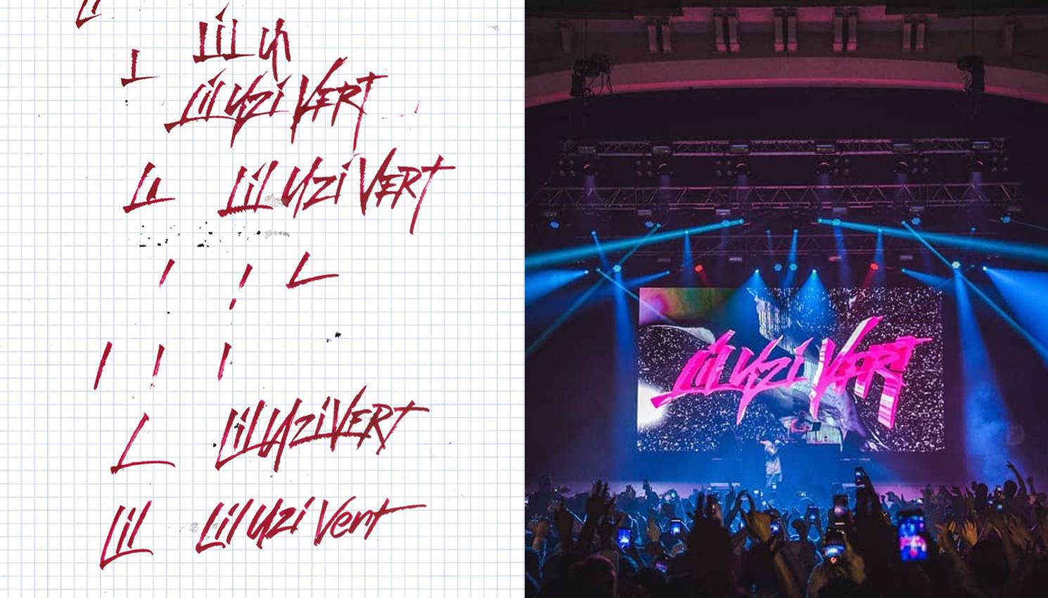
Yeah, I think I liked the Lil Uzi Vert project the most because of how easy the process was. That was probably the easiest project I've done because I just did it on a napkin, one time on paper, scanned it, and it got used. It looked amazing. That's my favorite. Some other projects get really stressful.
What's your favorite thing about hand lettering in general?
I like hand lettering because you're working traditionally with pen and paper. There are so many types of paper and so many types of pens. Not all pens give the same finished product. If you work with marker paper and a brush pen, for example, you'll get a grittiness you wouldn't get otherwise. I always like the natural feel of pen on paper. It's so amazing.
You were saying earlier that depending on your mood, you might come up with something completely different. Can you explain that a little?
Sometimes I get into a cycle or a groove where I'm feeling good. Just recently I've been feeling really good and creating every day. When I'm in cycles like that, I think of new things a lot more easily. Like, the two previous months before I got with my current girlfriend Ruth, I was honestly so sad and depressed, and a lot of the stuff I produced wasn't very wild or original. But ideas like "Pulitzer Kenny" that came after that were more unique and refined. I'm able to play around more when I feel good. When I don't feel good, I just stick to more basic things, like aggressive type—which is easier to produce for me.
Instead of getting original work from someone like you, artists could just use a free font from the internet. Why would you say it’s worth it for someone to use custom hand lettering?
I’ll give an example. RL Grime uses all this custom type from David Rudnick that's molded to his brand. It's really original and high quality. You know someone really put time into it and that correlates with his music, too. So people respect it more than if he just used a regular Futura font or something. [Laughs]. You've probably seen the trend of artists using a wide bold font and putting it on their cover. That shows people the artist didn't really put time into it. Having custom type gives a song or an album its own personality.