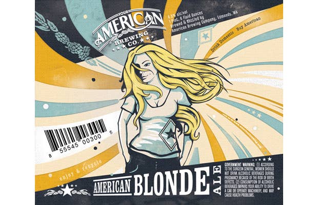

American Brewing Company has a new look thanks to Seattle's Taphandles (specialists in beer logo design). Spot on with trend, the inspiration for the packaging is mid-century Americana and WWII-era posters. We're loving the "American Blonde" label. Fun fact: The Oatmeal Stout graphic is influenced by the breweries location, right next to a train station, and the owner's interest in presidential campaign trains. [Dieline]