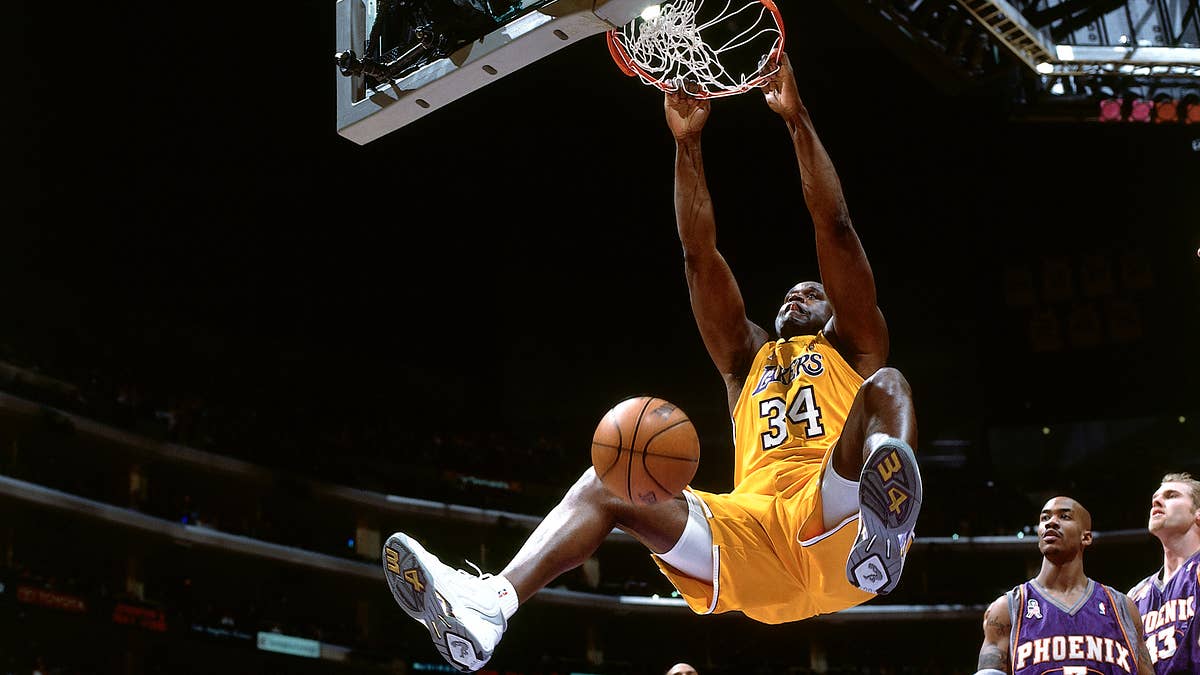

Since 2006, all 30 NBA teams have had their uniforms designed and manufactured by Adidas. But beginning this fall, Nike will take over those exclusive rights. In addition to making some slight alterations to the cuts of the uniforms, Nike has also worked with each team to improve their overall look heading into the 2017-18 season.
So far, we’ve gotten a look at every team’s home and road sets, rebranded as “association” and “icon” uniforms because, well, Nike. And by opening night in October, Nike will have introduced at least two more uniforms for each team. Here is our ranking of the uniforms we’ve seen so far.
Confirmation of unchanged look for Miami Heat pic.twitter.com/OnFpHeYvvw
— Mike Ryan (@MichaelRyanRuiz) August 11, 2017
The Heat have been oddly quiet through the Adidas-to-Nike switch, with no indication of whether or not they plan to make changes to their uniforms this summer. A leaked, Zapruder-style photo of rookie Bam Adebayo rocking a Nike-sponsored Heat uniform earlier this month led many to believe that no changes would be made to Miami’s kits. But the fact that the Heat have yet to tweet or Instagram a single shot of Adebayo from the rookie photo shoot at which that picture was taken makes us suspicious. They get an “incomplete” for now.
New threads for the 2017-18 season. 🚀 pic.twitter.com/AhFbbTTLeK
— Houston Rockets (@HoustonRockets) August 10, 2017
Your most swagless homie.
Our new look and Nike uniforms are here. Learn more about the inspiration and design at https://t.co/nq0ocByehL#WeGrowBasketballHere pic.twitter.com/ObUAIcXEtf
— Indiana Pacers (@Pacers) July 29, 2017
The Pacers really tried something unique with this totally revamped uniform. The moral of the story is never try.
Mark your calendars! New jerseys will be available for purchase at @MavsHangar on 9.29.17! pic.twitter.com/3Zye1DydSE
— Dallas Mavericks (@dallasmavs) August 11, 2017
Even the mannequin’s pissed the Mavs have to wear these things.
Season threads 😍🔥 pic.twitter.com/qzePGj9iua
— Atlanta Hawks (@ATLHawks) August 17, 2017
Nike couldn’t have made this thing look more Nike if they wanted to. And we know they wanted to.
The New Wave is here.
Get familiar » https://t.co/cpKEj3q7kW pic.twitter.com/beYWWNE5Oj
— LA Clippers (@LAClippers) August 11, 2017
They couldn’t get any worse. These are at the very least inoffensive.
What's new with the new Association and Icon uniforms? Lots of innovation from @nike. pic.twitter.com/wk83VvYlzY
— OKC THUNDER (@okcthunder) July 26, 2017
The Thunder have spent a decade in these bunk-ass uniforms. Russ deserves better.
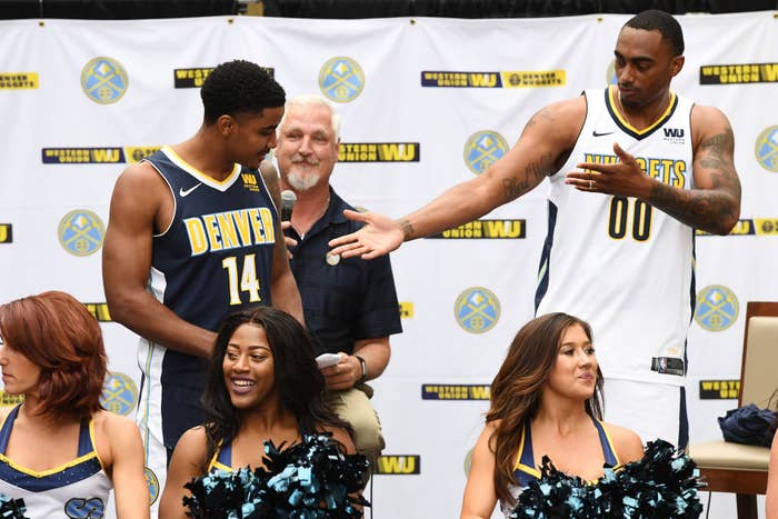
🔥🔥🔥#MileHighBasketball pic.twitter.com/yvee9aB7qG
— Denver Nuggets (@nuggets) August 8, 2017
When you fire up create-a-team on 2K.
Nothing can stop him, he's all the way up - @FWJackson15 lookin' fly at the 2017 @NBA Rookie Shoot! #Pelicans
📸: https://t.co/1xNvZyjxS2 pic.twitter.com/JaUY14wIZR
— New Orleans Pelicans (@PelicansNBA) August 11, 2017
A team that plays in Salt Lake City does a better job of capturing the spirit of New Orleans than the Pelicans do. Think about that for a second.
Get familiar with the new threads » https://t.co/rc9i08Nnyx #NewEraNewThreads pic.twitter.com/S7DJmuOWSW
— Timberwolves (@Timberwolves) August 11, 2017
Of all the new uniforms unveiled this summer, these are without a doubt the most adventurous. This is a complete departure from Minnesota’s past and, while we like where the Wolves’ heads were at, it unfortunately falls flat.
Next, the Icon Edition, with Detroit across the chest. 🔥 pic.twitter.com/2oPMAn26Mf
— Detroit Pistons (@DetroitPistons) July 26, 2017
Meh.
The Rookie ⚫️⚪️ #PaniniNBARookie pic.twitter.com/qVYBC39NTr
— Brooklyn Nets (@BrooklynNets) August 11, 2017
“Brooklyn, get on your feet and give it up for your 2017-18 Infor Nets!”
Lookin' good @1jordanbell 📷🏀 #NBARooks pic.twitter.com/cX8Mgq3Wuh
— GoldenStateWarriors (@warriors) August 11, 2017
These are pretty nice and are quickly becoming a classic due to the success of the team since they were introduced in 2010. However, the Warriors did nothing to address the awful neck profile their jerseys have had for the better part of the last decade. I mean, what even is that thing?
There's "Magic" in the air tonight at the 2017 @PaniniAmerica @NBA Rookie Photo Shoot. @OrlandoMagic #WhoDoYouCollect #PaniniNBARookie pic.twitter.com/hhBN2rPZBK
— Panini America (@PaniniAmerica) August 11, 2017
The Orlando Magic have yet to officially unveil their new Nike uniforms, but we were able to get a sense of what they’ll look like when rookies Jonathan Isaac and Wesley Iwundu donned them for their rookie photo shoot with Panini earlier this month. Not much has changed, other than some black piping on the side of the jersey.
.@YoungIvee lookin' sharp at the @NBA rookie photo shoot! 🔥 pic.twitter.com/hHFM5xHzTZ
— Memphis Grizzlies (@memgrizz) August 11, 2017
The Grizzlies didn’t change a whole lot, but the big change they did make—lightening up the lighter two of the three shades of blue on their uniform—is a huge improvement. Where the multi-blue look used to create a dulling effect on Memphis’ road jerseys, these new ones really pop.
The @Raptors' @OAnunoby gets portraits shot by @babsphoto at #PaniniNBARookie shoot! pic.twitter.com/vzOWPh5eXa
— NBA (@NBA) August 11, 2017
The Raptors only made one slight tweak to their uniforms under Nike, cleaning up the underarm piping of both their primary kits. Still, Toronto has one of the more striking looks in the league, so minimal change is probably a good thing here.
Paying homage to the game.
Paying tribute to our heritage.@Nike’s Association + Icon edition uniforms for the Wine & Gold.#AllForOne pic.twitter.com/5b1cHxZjW4
— Cleveland Cavaliers (@cavs) August 7, 2017
In recent years, the Cavs experimented with so many different colors—wine, navy, gold, black, and white—that it’s been hard for them to carve out a consistent brand. With this new uniform, they were able to connect on something clean that is also representative of their existing identity. The Goodyear logo on the left breast is one of the nicer sponsored patches we’ve seen so far.
Uniform Details: New-Look Knicks Nike Jerseys https://t.co/U5LfmqALk2 via @nyknicks
— NEW YORK KNICKS (@nyknicks) August 11, 2017
Classic. Clean. Crisp… Why not just slap a Nike logo on there and call it a day?
The Association Edition. #DCFamily pic.twitter.com/8b9cxixrPA
— Washington Wizards (@WashWizards) August 3, 2017
For years after changing their identity from the Bullets to the Wizards in 1997, the NBA team representing American’s capital dressed in a gaudy combination of teal and bronze that was even more offensive than their violent former name. But several years ago, they returned to a patriotic striped look more befitting Washington, DC’s home squad. They’ve basically kept things the same since then, and even after more than half a decade they still look fresh.
— Boston Celtics (@celtics) August 11, 2017
No surprise, the Celtics kept things simple and clean this season, as they have for the better part of the last century. It still works after all these years.
The Icon. pic.twitter.com/HWXA6WNKpu
— San Antonio Spurs (@spurs) August 11, 2017
Ditto. Don’t mess with a classic.
Logo status.
The Jumpman has a permanent home on the @hornets jersey. pic.twitter.com/3Tckr4xDfW
— Jordan (@Jumpman23) July 31, 2017
Charlotte opted not to make any substantial changes to their look this coming season, but that’s okay. The Hornets have one of the best color schemes all of sports, and these uniforms do a nice job of highlighting that awesome teal and purple combo. The fact that they’ll be the only team in the league with owner Michael Jordan’s Jumpman logo on their right breast instead of the Nike swoosh is a huge bonus.
FIRST LOOK: Introducing the official Chicago Bulls @Nike Icon jersey, which will serve as our primary home uniform this season. pic.twitter.com/OtMRZww8Mu
— Chicago Bulls (@chicagobulls) August 2, 2017
A slightly larger wordmark and number profile really make this classic jersey pop. And changing the name font on the back of the jersey from black with a white outline to plain white is a nice improvement to the team’s red uniform, which will serve as their home kit this year.
The rooks are ready to roll. pic.twitter.com/pN1vv95kvT
— Los Angeles Lakers (@Lakers) August 11, 2017
Love ‘em or hate ‘em, the Lakers have a timeless look. Under Nike, Los Angeles decided to keep it simple and basically run it back with their 2016-17 Adidas uniforms. No complaints here.
Homage x Heritage | The Association x The Icon
Details: https://t.co/N7gYFsC0Mj pic.twitter.com/b6aSe7c5gg
— Utah Jazz (@utahjazz) August 9, 2017
After rocking one of the most beloved uniforms in league history in the late-90s and early-2000s, the Jazz underwent one of the worst NBA rebrands ever in 2004. Thankfully, they’ve found their way in recent years, returning to a look more reminiscent of their pre-Salt Lake City history in New Orleans. These uniforms are killer, and the fact that they’re using their sponsorship patch to raise money for a cancer charity is a definite bonus.
— Devin Booker (@DevinBook) August 10, 2017
One of the teams who underwent the biggest change under Nike, the Suns really knocked this out of the park. And after absolutely bricking the hell out of their 2013 rebrand and embracing a largely purple-free aesthetic, Phoenix seems to have learned its lesson. These might not be as dope as the sunburst uniforms of the 90s, but they’re super nice and definitely worthy of a top-five spot on this list.
.@MarkelleF taking the new unis out for a test run.
📷 | https://t.co/3OsQg5dk7B pic.twitter.com/8Ltqf2CvE3
— Philadelphia 76ers (@sixers) August 1, 2017
Every time a team decides to rebrand, a large portion of their fanbase will inevitably clamor for a return to an aesthetic they once had in the past. The Sixers knew this when they unveiled new kits two years ago and decided to simply throw all their history into one mashup kit, from the old school “PHILA” wordmark, to the funky stars on the side paneling, to the classic trim and outlines throughout the uniform. With the switch to Nike, Philly decided to add another element, the drop shadow from their short-lived, early-90s gradient jerseys. These are some of the most unique uniforms in the league.
.@FrankMason0 in the Jordan V Flight Suit during rookie photoshoots! pic.twitter.com/HKakjouI3d
— Kings Kicks (@sackingskicks) August 11, 2017
The Kings may not win a lot of games this season, but they’ll definitely be the best-dressed losers in the league. After undergoing a full-scale rebrand last summer, Sacramento made only a few small changes under Nike. But the alterations they made—changing their road wordmark from “KINGS” to “SAC” and making it silver, cleaning up the cut of the jersey’s neck, and adding a waistband logo—really make this one pop. However, they lose some points for being sponsored by a damn almond company.
Full details of our new look with @nike & @harleydavidson at https://t.co/QR5fYiNlJn pic.twitter.com/MuKt8caFGA
— Milwaukee Bucks (@Bucks) August 10, 2017
Don’t fix what ain’t broken. Two years ago, the Bucks went through a complete rebrand that came with new colors, new logos, and a gorgeous set of new uniforms that paid homage to the team’s popular “Irish Rainbow” sets from the late 70s, 80s, and early 90s. These are basically identical to the team’s most-recent uniform under Adidas, but with a Harley Davidson logo slapped on the left breast.
Looking good, @zcollins_33 and @calebswanigan50.
📸 » https://t.co/7Vf3K72nhd pic.twitter.com/WeZsZBMdsy
— Trail Blazers (@trailblazers) August 11, 2017
Bravo…These may not be a huge departure from the kits the Blazers have worn for the past half century, but they’re absolutely beautiful. Of all the teams that took the switch to Nike as an opportunity to introduce some slight tweaks to their uniforms, Portland did it best. In the end, they made improvements to their wordmark, numbers, and piping, while adding a dope “Rip City” patch on their waistband. These are clean as hell.