

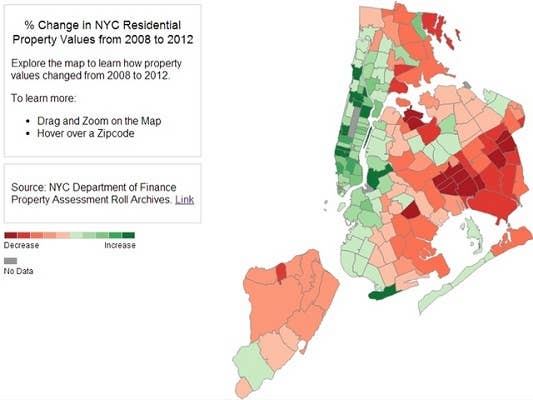
Calling all New Yorkers and aspiring New Yorkers: do you want to have your dreams shattered and the rest of your week ruined? This map shows where can and probably can't afford to live in New York City based data from the NYC Department of Finance Property Assessment Roll Archives.
Chris Walker created the map after carefully analyzing changes in property values between 2008 and 2012. The reddish regions represent areas where they've decreased, while the gren represents the areas where they've increased.
While prices in Western and Southern Brooklyn, Greenpoint, Manhattan, and parts of the south Bronx have risen (or soared) since 2008, they've continued to fall in eastern Brooklyn and Queens.
Feel free to further torment yourself here.
[via Gothamist]