Click on the magnifying glass button to expand the image.
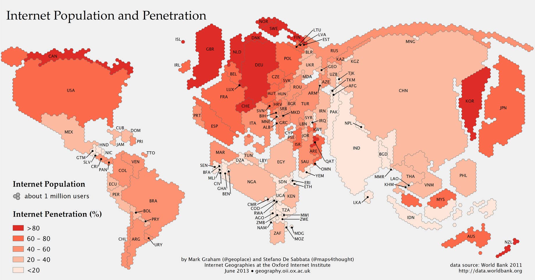
Oxford Internet Institute's project, Information Geographies, has pieced together a map that outlines the world's countries and what they would look like according to the size of their online populations. It comes in the form of two partnering packages of information: first, is the size of a country's online population, which is represented by the size of the country on the map. Secondly, is the percentage of the country's population that's online, represented by the color of the country. For example, since Canada's population (relatively) isn't that big, it doesn't take up that much space on the map, but since more than 80 percent of its citizens are online, it has a deep red color.
"The distortion in the map paints a revealing picture about human activity on the Internet," Oxford says on the projects website. "China is now home to the world’s largest Internet population at over half a billion. The United States, India, and Japan then follow as the next most populous nations of Internet users."
The authors of the map see two important trends emerging:
First, the rise of Asia as the main contributor to the world’s Internet population; 42% of the world’s Internet users live in Asia, and China, India, and Japan alone host more Internet users than Europe and North America combined. Second, few of the world’s largest Internet countries fall into the top category (>80%) of Internet penetration (and indeed India falls into the lowest category, at <20% penetration). In other words, in all of the world’s largest Internet nations, there is still substantial room for growth.
With Google and Facebook pushing initiatives to get more people online, this map will sure look different in the coming decade.
[via The Atlantic]