
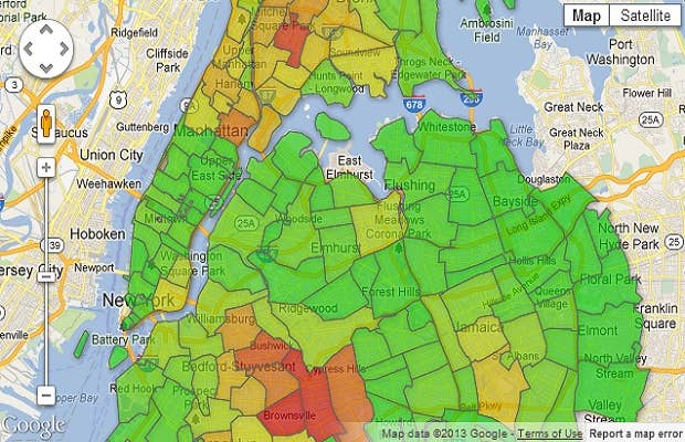

In a quest to determine where most of New York City's prisoners come from, Gothamist has created an interactive map that shows how many people are incarcerated annually organized by the neighborhoods they come from based on data from the New York City Department of Corrections.
The first map shows where most prisoners list home addresses; most are located in the South Bronx, East New York, Brownsville, Bedford-Stuyvesant and Harlem. A whopping 3,800 Brownsville residents were locked up last year, while 1,796 South Bronx residents were placed behind bars.
The second map illustrates prisoner growth according to zip code between 2007 and 2012. Neighborhoods such as Chelsea, Murray Hill and Staten Island all saw a 14 percent increase in residents sent to jail during that period.
The final map shows where out of state prisoners reside. They all come from the East Coast, but their homes range from the Canadian border all the way down to cities in Florida like Miami, Orlando and Tampa. On the bright side, less New Yorkers are being jailed, although that could also mean the NYPD is too busy harassing innocent people through "stop-and-frisk" to catch all of them.
So yeah, there's that.