
If you spend enough time engaging in deep-dives about the aesthetics of music in 2020, you're bound to come across someone who will fervently argue that the importance of cover art has diminished. These people are, to put it simply, wildly wrong.
Not only is such a stance rooted in a years-long misunderstanding about the pace of the industry, as we've been in the iPhone era for quite some time now, but it ignores the unique opportunity artists have to ensure their cover art—whether for a single or an album—becomes as omnipresent as the music itself. In a bygone era, the average listener could feasibly plop an album in their car CD player without seeing or even thinking about the cover ever again. Throwing on a song or an album now, however, often requires at least a passing glance at an artist's chosen Bat Signal with every listen.
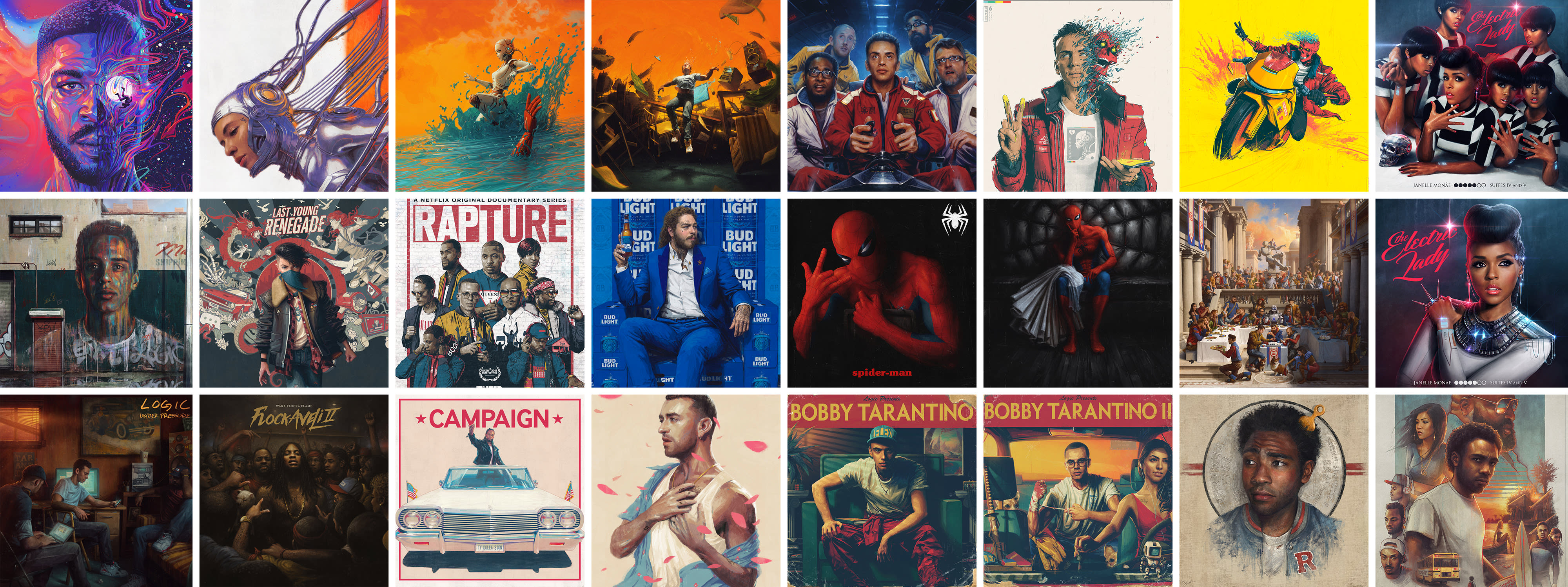
For Kid Cudi, an artist whose legacy extends across multiple eras of preferred music consumption methods, the importance of cover art has remained consistently upfront in the presentation.
While the trilogy-launching The End of Day centered on a depiction of Cudi, by Bill Sienkiewicz, looking away from the listener, the head-on perspective for its sequel The Legend of Mr. Rager—featuring photography from Pamela Littky—placed Scott center stage on the cover.
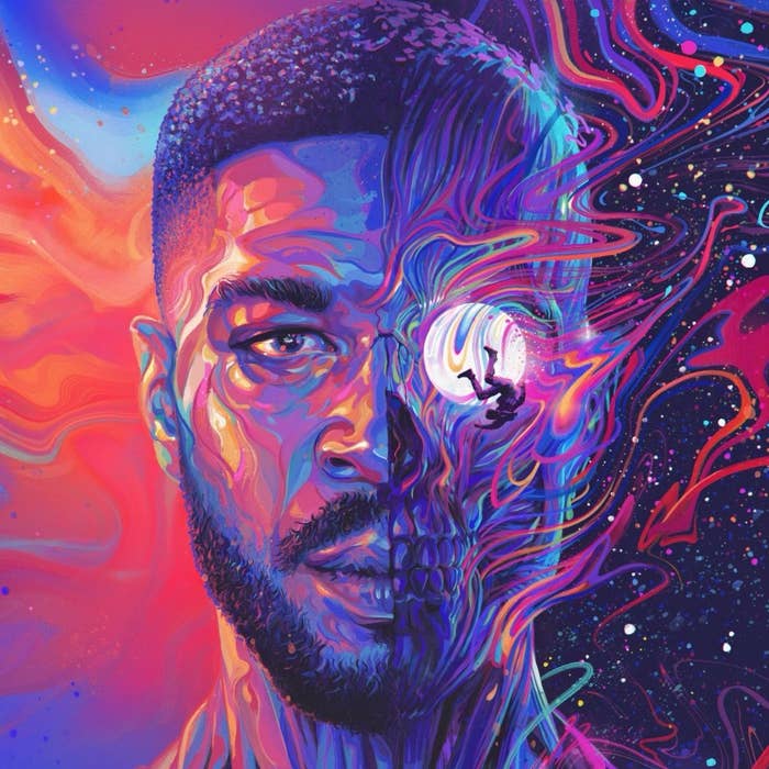
For Man on the Moon III: The Chosen, Cudi turned to Sam Spratt, whose other 2020 creations include Logic's No Pressure and 070 Shake's Modus Vivendi covers. The cover features Cudi staring directly at the listener, a marked (and fitting) departure from his downward gaze on The Legend of Mr. Rager.
Complex reached out Spratt to get the full story behind his latest feat of aesthetics, resulting in an in-depth discussion touching on everything from his creative process (and how it differed slightly with MOTM III) to his hopes for the new year.
If you can, walk us through how you ended up getting involved with Cudi and his team.
Couple weeks back, I got a text from Bob/Logic at 2 a.m. saying "Cudi just called me, [he] wants you to do his album cover." Bob is a good friend and a good guy but he is equal parts earnest, sweet, and absolute troll. So at first I thought he was full of shit. He called me up and was like, "No, no. This is very real. Scott called me and said 'You always have the covers, I need your art guy. Can you connect me with Sam?'"
Got on the phone with Scott the next day. Talked for an hour or so out of the gate just to get to know him and see where he was at in life, what he was feeling to prompt a return to MOTM, and what he was hoping to accomplish with the cover. Which is all great, but I also only had four days to create the cover before I had to pass it off to the label. Mind you, the album has been cooking for infinitely longer, but my involvement was an audible.
Did you feel any external pressure given the weight of this project and how personally connected fans are to the Man on the Moon series?
It's someone else's fans so not really. Obviously it'd be neat if they like it as much as Scott likes it but I can't pretend they're here for me. Any praise or attention given to me through something like this is almost entirely just residue from the actual musical artist I'm working for—no amount of nice things said can change the reality of what I need to work on or where I need to improve.
And any criticisms I may receive might be absolutely valid but I guess they will also just never hold the same kind of weight or be quite as pointed or specific as my own criticisms of myself and the ways I want to/need to get better. Most of my pressure was just working with an artist I respect and wanted to do justice, while only having a few days to conceptualize and deliver on something usually I would have weeks to tackle and let breathe.
Did the fact that this album marks the final chapter in the Man on the Moon story have any conscious influence on your creative direction?
Not initially. But it eventually steered us towards a color palette that pulled from the original [by Bill Sienkiewicz] and the starry background from [Man on the Moon II: The Legend of Mr. Rager]. Distinct but with that feeling of something bending back in on itself to close the loop. Not unlike what was attempted with [Logic's]No Pressure cover vs. Under Pressure. It's nice when things have endings.
Were you given access to the album prior to crafting the cover? What else did Cudi and his team send over?
Yes, along with various photos and videos as reference points.
What did you hope to capture with the Man on the Moon III cover?
Mostly, just what Scott was feeling. This was about as hands-on of a process as I've ever done with an artist: constant back-and-forth, a lot of phone calls and texts speaking to what he's been going through, and distilling it into something visual. Speaking in both abstract tongues of "vibes" as well as specific feelings he had about certain colors, brush strokes, and energy.
That is always the goal with an album cover, which is essentially a glorified piece of marketing or advertising key art: something that would stand out in a Spotify gallery and steer the algorithm.
What’s your typical creative process and how much of that was the same (and how much of that was different) when crafting the Man on the Moon III cover?
The similarity is that it's one-on-one with the artist, a direct dialogue.
There are labels with excellent art departments and art directors who I've been lucky to work with in the past but it'll always just be easier when you're building a language directly with the musician versus having to try to translate them through the filter of an intermediary. While I can't say I've always been this way, I just take zero offense if Donald [Glover], Janelle [Monáe], Bob, Dani [Moon], Scott, whoever says they're not feeling something I make. It's much more efficient to just hear the truth, toss it, and keep moving and exploring new directions rather than have it softened before it gets to me.
The big difference was just how much more in real time it unfolded than my typical project. Usually, whether I'm working on an album, for a film, on a game, etc;, it comes with many more stages and is much more drawn out. Mood boards, thumbnail sketches, refined sketches, color comps, final details, etc. Goalposts and deadlines where stages are presented more formally.
For this, our timeline was so accelerated that sleep was out the window and instead I spent the first two days drowning in coffee [while] throwing various concepts, mocks, sketches at him—very crude and rough, all in real time—just creating, discarding, creating, and discarding.
[I] began with a portrait of him vignetted around a bunch of scenes he wanted of him falling or drowning. Felt too busy. Then images of him and a Porsche 911 falling from the sky into moonlit water. Dug it but wanted him to be more prominently depicted. Then the same scene vignetted inside of a side view of his head. [The] car felt a bit much, and felt way too similar to the first cover. Then straight on with the falling moon man, which was kind of our "Jumpman" symbol/icon, over his eye. Close. Then he wanted Mr. Rager to come through and the concept that came out from that is very obvious.
Once we landed on this spectral psychedelic/prismatic explosion of bones and sinew which he really connected to, the rest of it [consisted of] texting him the pencil sketch, rough color, refined color, the various attempts at creating the various swirled spectrums of color [with] both the warm and soft ones on the left and the more explosive tripped out on the right (note: Scott's number one piece of art direction which will stay with me long after this: "yea like that, but trip it out").
We iterated a lot on the coloration across the whole thing in the latter stages, beginning with a much cooler and more blue/purple image, then more teal vs. red, dark vs. light, then gradually working in more warmth and vibrancy into the light with the right side being something that came more effortlessly with less iteration than the left.
What was Cudi’s initial reaction to seeing the cover?
Since he was getting updates on it every few hours over the course of a few days, it's not like there was some grand reveal, but when I sent over one of the closer to final drafts, there was the closest thing to what felt like an authentic reaction. We were on the phone, middle of the night, he was with some friends/team members. I was fried at this point from staring at the same thing with no sleep for days, just hoping what I was looking at was something other people might want to look at too.
He says "Mannnnn" in that classic hummmm voice, turns and shows it to them. I could hear some background noise of kind words and "oh shits," and then he said something to the effect of: "Man, this is something you could find 30 years from now and even if you don't know who I am, you'd have to listen to it." That it is his favorite. Mind you, Scott is a very nice guy, so time will tell how much that holds in his eyes. But I often feel a sense of disconnect working commercially, that it's all art for other people's art or selling stuff. It is 100 percent that, not just a feeling, but I'm still happy when I've made someone else happy.
It's a good feeling knowing that the art slapped on his art was something he connected to with a sense of permanence in terms of decades, not just in a moment.
What was the first Kid Cudi song you remember hearing and how did it impact your own personal music taste?
I've enjoyed his music since MOTM like a lot of people. I'm sure there's a thread to pull from him to the rest of the soup of music I like but I imagine he's touched a lot of it in some way.
How does it feel to now be a part of the larger Cudi legacy?
Just good to meet the guy. Very kind man. His legacy is definitely not mine even a little bit but I do always enjoy getting to know people, especially people who have spent a long time honing a craft, whatever it may be. It's always nice to move past any of the veils and the myth-making that surrounds talent or even just celebrity to something more interesting. Less serious and mystical. But more interesting.
Who or what are some of your personal inspirations?
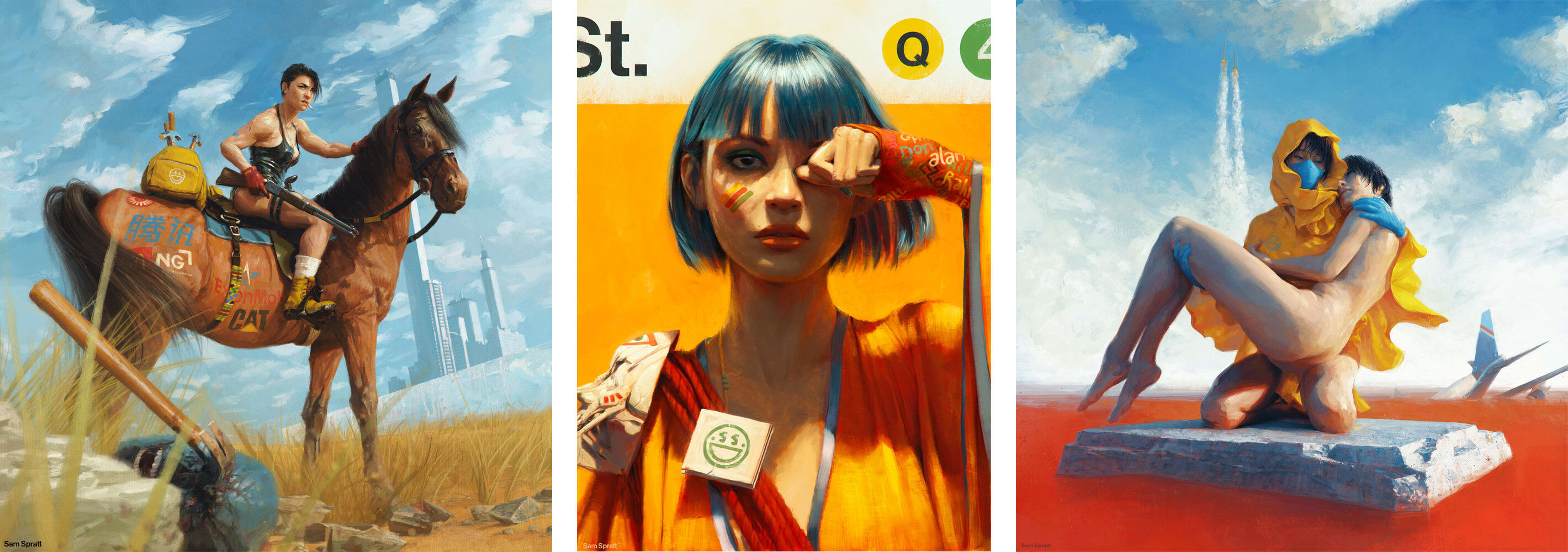
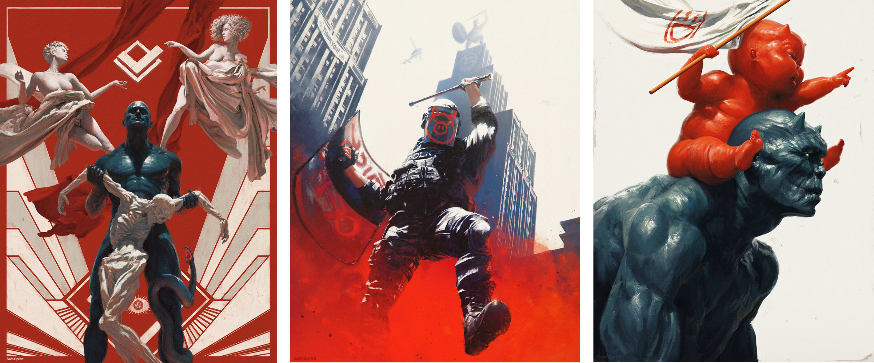
Murray Bookchin, Rick Perlstein, Cronenberg, Sadamoto, Jean, McGinnis, Ofili, Rockwell, Rubens.
What are your hopes for 2021?
That every policy and cultural shift for the last 40-50 years that has pushed western society towards living increasingly atomized, isolated, and aesthetic-driven lives won't just break us all into a new level of dissociative cyberpunk cope after being forced evermore inward from the pandemic.
But for me? I hope to make things I feel connected to and get better at making them. Seems like a good place to start.
Sam Spratt is an illustrator based in Brooklyn, New York. He's also been behind instaclassic cover art for Ty Dolla Sign, Childish Gambino, All Time Low, Janelle Monáe, Wale, and more. Follow him on Twitter here and Instagram here. For more info, click here.