

"I don't know what the hell it is, or what it looks like. It's uncommunicative, like most of the millions of lousy logos in the world," legendary designer George Lois wrote to us an email.
We asked him to weigh in on Airbnb's new logo, known as Bélo, a pink and white squiggle that's been compared to a ballsack, a vagina, a butt, or, in a less dirty-minded light, office supplies. "At first glance, I thought it was a new design for a paperclip," wrote Lois.

Airbnb's new logo was the result of months and months of work from the company's CEO, Brian Chesky, and the London-based firm DesignStudio. It was meant to synthesize different graphic icons—a location pin, a stick figure person, a heart, and the A from Airbnb—and be simple enough for anyone to draw. This plan backfired when the logo was released yesterday and was met by a comedic firestorm of online parodies.
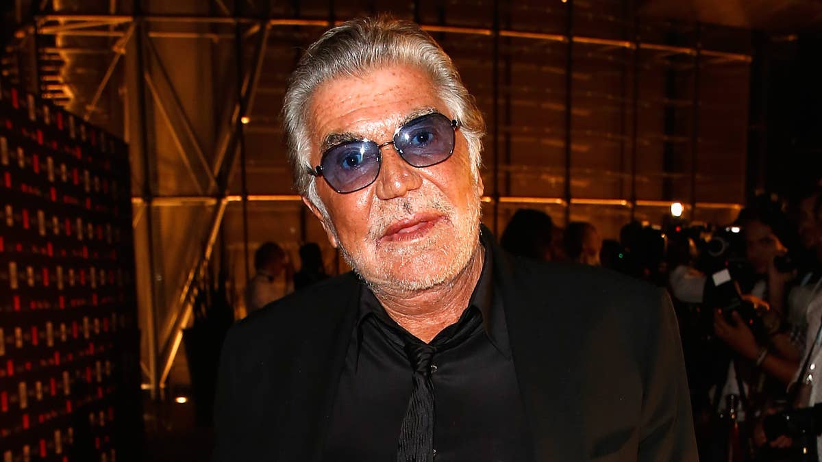
Because he has for years been a pivotal figure in the design community, we solicited Lois' opinion on the logo. Born in New York, Lois made a name for himself in the '60s and '70s designing 92 covers for Esquire in 10 years. He went on to design for big name clients like The New York Herald Tribune, MTV, Tommy Hilfiger, ESPN, and various senators. He's also coined the term "The Big Idea," an innovation in advertising that has the power to cause a "marketing miracle."
While some designers have stoodup for Bélo online, Lois was not afraid to call a spade a spade. In addition to letting us know his thoughts on the design, he offered his advice via email on what logo creators can do better.
A memorable brand name interacting with a strong visual symbol to communicate a humanistic idea is the ultimate art form in popular graphic communication. A great logo triggers visual recognition that immediately sears a product’s virtues into a viewers brain.
There you have it, from the design god himself.