
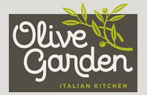

As a part of a "comprehensive brand renaissance plan," Olive Garden unveiled this new logo to their investors along with a detailed presentation that outlines the restaurant's future. The logo still includes the full name of the restaurant but uses a drastically different font, and it does away with the fun color scheme that we have shamefully come to love.

The new logo does look more Internet-friendly, but the old one had a lot more character and worked with the interior design of the restaurants. When you think of almost-Italian food, you think of Olive Garden and their faux-Tuscan interior design. Now, not only will the logo change, but the menu and the entire aesthetic will too. Maybe these changes will improve the reputation of the chain, or it could leave them drowning in their own oils.
[via BuzzFeed]