
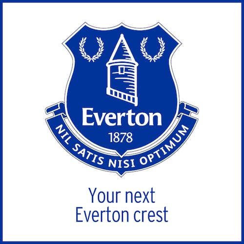
The Everton Football Club unveiled a new crest back in May and got an overwhelmingly negative response from fans, bad enough that they were forced to rapidly create a new one.
A couple of the gripes that fans had about the current crest were that "Nil Satis Nisi Optimum" and the laurel wreaths were not included and that the depiction of the Tower was too graphic and less real. After gathering feedback and analyzing the likes and dislikes, Everton worked with Kenyon Fraser to create a series of designs and the fans got to choose the winner. The design above will replace the five-month-old badge for the 2014-2015 season, but to be honest, it's not that great. The fans can't complain anymore because they voted for it, and the current design does sort of resemble a community college crest (sorry), but there is nothing spectacular about the 2014/2015 design. Feel free to disagree in the comments below.
RELATED: Bad Logo Re-Designs
[via CreativeReview]