
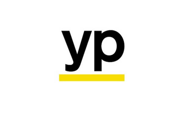

Yellow Pages, the telephone business directory, has recently unveiled their new YP logo redesign. The company has been going by the abbreviated YP for a while now and are getting rid of the branding that included the initials "YP" in black against a yellow background with a glare over half of it, similar to a mobile phone app logo.
 The new logo uses the same color scheme and initials but trades the frame for an underline. Designed by Interbrand, the new logo is inspired by "the gestures of the multi-tasker: underlines, checkmarks, circles, and highlights — where the yellow line becomes a visual shorthand for efficiency and task completion," says Interbrand's creative director, Forest Young.
Check out the promo video below to learn more about the new, simplified logo design:
RELATED: Bing is Getting a New Modern Logo and Layout
RELATED: Not to be Outdone, Google Introduces 'New' Logo and Navigation Button
[via DesignTaxi]