
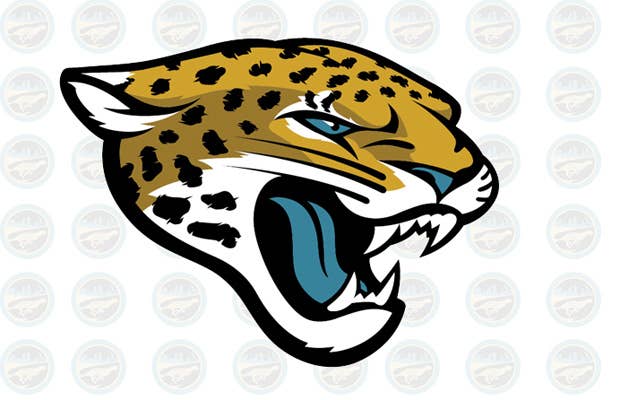
After 18 years of using their previous logo, the Jaguars have unveiled a new one that more closely resembles an actual jaguar and looks less like the logo of the Jaguar car company. Owner Shad Khan aimed to make the logo more modern and vibrant by giving "life" to the jaguar's eyes and a more defined nose.
As with all logo designs, skepticism exists. Does this logo communicate a new, more progressive direction for the Jaguars, or is it a fail?
RELATED: Best Popular Brand Logos
[via BigCatCountry]
LIKE COMPLEX ART+DESIGN ON FACEBOOK