When you think “iconic NFL logos,” there are a few that pop into just about everyone’s mind: the Cowboys, the Steelers, the 49ers, the Raiders, just to name a few. In other words, pretty much any team that was good back in the day. These logos aren’t iconic just because they look “cool,” but because they have a history attached to them: Legends wore them, Super Bowls were won in them, and they have withstood the test of time.
And then there are the rest.
Some logos are just, to put it kindly, not iconic. The NFL has provided some of the worst looks of all time in addition to the best. For every Cowboys star, there’s a Browns whatever-that-is. For every Raiders face, there’s the L.A. Chargers trying to rip off the Dodgers. And for every Packers “G,” there’s a…you can fill in the blank with a bad logo of your choice.
Even as history has looked kindly upon some logos that were initially considered ugly (the cartoon Raptors jerseys used to get panned routinely), there are some that don’t even get the rose-colored nostalgia bump. In fact, some of them look even worse now than they did back then.
A lot of the logos on this list aren’t the team’s formal primary look, but rather an alternate logo. Unlike the NBA or NHL, NFL alternates don’t always see the light of day. So teams sometimes take liberties (often times way too many liberties) to try to give an orthodox look some aesthetic pop. A good many of these efforts fall flat.
Another common entry on here are cartoony logos from the ’60s. Some teams were able to pull them off (like the old Baltimore Colts logo), but most were not. And you’ll see a lot of those on here today.
So with all that said, here are the 33 worst NFL logos of all time.
34. Cowboys Alternate
33. Saints
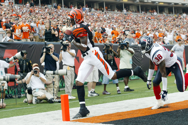
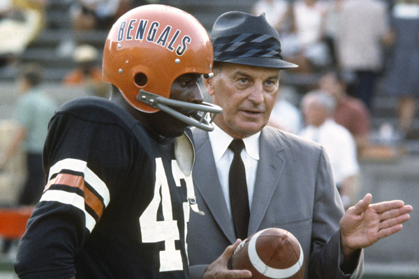
32. Bengals
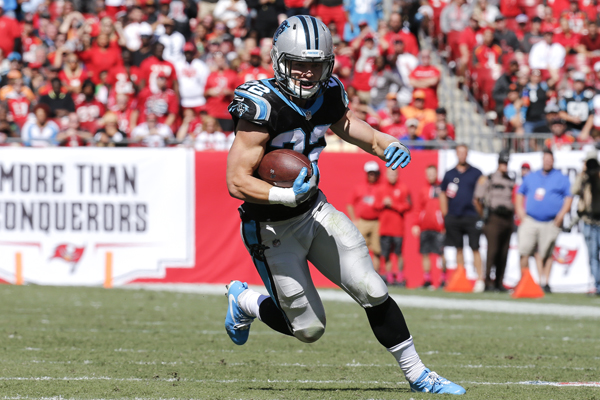
31. Panthers Alternate
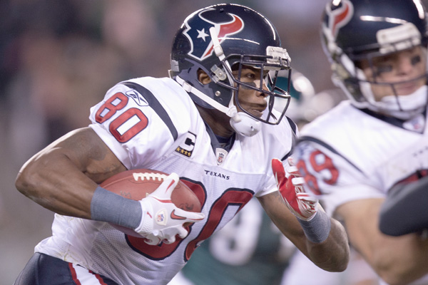
30. Texans
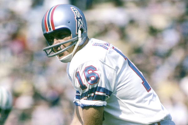
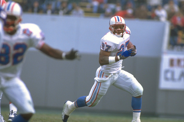
29. Oilers
28. Dallas Texans/Kansas City Chiefs
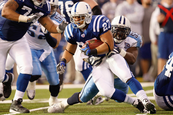
27. Titans
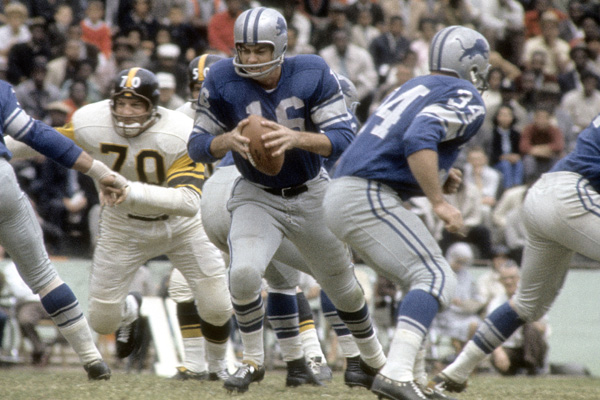
26. Lions
25. Packers Alternate
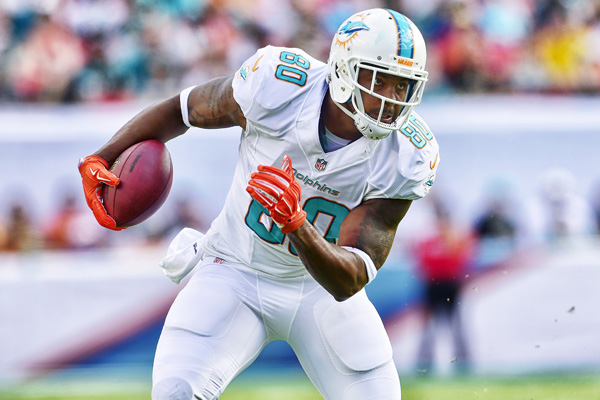
24. Dolphins
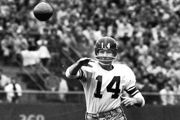
23. Giants
22. Buccaneers
21. Bears
20. Cardinals Alternate
19. Seahawks Alternate
18. Bills
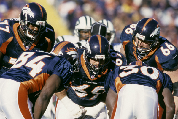
17. Broncos
16. New York Titans
15. Tennessee Oilers Inaugural Season Alternate
14. Bengals
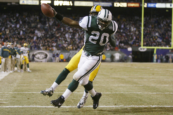
13. Jets Alternate
12. Packers
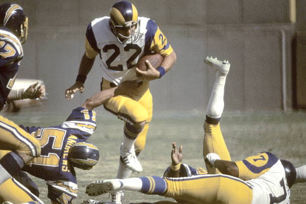
11. Rams
10. Broncos
9. Browns
8. Patriots
7. Browns
6. 49ers
5. Browns Alternate
4. Browns "Brownie The Elf"
3. 49ers
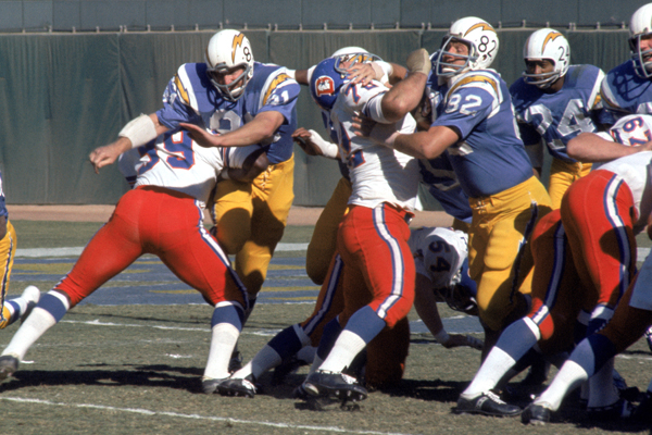
2. Chargers
Years Active: 2017
Remember when this thing blew up on Twitter?
When the Chargers formally moved to L.A., they unveiled this new logo on social media. And by “new logo,” they basically meant the Dodgers’ current logo, but with a lightning bolt. It’s impossible to not see the resemblance — or the fact that it’s a garbage logo altogether.
The logo received universally negative reviews on social media, and the backlash prompted the Chargers to remove this logo after just two days. Not the kind of buzz you want to be making upon relocating your team. The Chargers were never really a fit for L.A., and this logo pretty much solidified that from the get-go.
See logo here