

Yesterday was the 11th celebration of World Day Against the Death Penalty, so the Huffington Post created a infographic that broke down the death penalty's geographic inequality. The United States is one of the top five countries in the world for executions, and the 43 executions that took place in the U.S. last year occurred in just nine states. There were 15 alone in Texas.
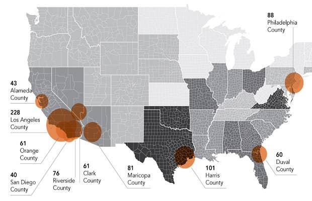
Furthermore, the Huffington Post learned that only two percent of the counties in the U.S. are responsible for the majority of the executions in the country dating back to 1976. Furthermore, those counties hold most of the country's death row population. The infographic also helps to point out the current death row population according to race and identifies the region of the U.S. with the most executions.
The results shouldn't surprise anyone.

[via The Huffington Post]