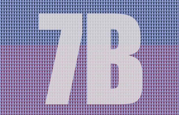
Earth’s population surpassed 7 billion back in 2011. Now, that’s a pretty large number. A population in the billions is probably difficult to wrap your head around, but this infographic lays it all out for you. Literally.
The 7 Billion World website has placed 7 billion tiny icons, representing every single person in the world, on one screen. If you scroll left, right, up or down, it seems to go on endlessly. Place your mouse on any of the person-shaped icons, and a small window will appear telling you what number it represents out of the 7 billion. The icons are color coded by region: yellow represents Asia, red is the Americas, blue is Europe, and black is Africa. Grasping the number of people you share the planet with can be a humbling experience.
For some added depth, especially if your screen is on the smaller side, hook up your computer to a large monitor and scroll away.
[via PopSci]

